Showing posts with label mixed media. Show all posts

Monday, 16 December 2024

December doodle


 This time the challenge of 'Goed Gezien - Goed Bekeken' was to make a December doodle. So we could just doodle away in a December or Christmas mood or make a zen-tangle work, both things I do not do very often.

Of course I had to do this my way so I made a drawing of two Christmas Balls first and after that had dried (I used water soluble graphite) I added the strings.

Now it was time to doodle or zen-tangle. I started in the balls, using the shapes of the zen-tangle to create the shadows and expanding these tangle shapes into the figures below the balls. Of course I did not follow the 'rules' of zen-tangle, I used two colours of line markers and added some pencil for extra colour.

The information about the materials I have used, the size of this work and its availability can all be found in my Tumblr blog

Sunday, 20 November 2022

Shards bring good luck...


The November challenge of 'Goed Gezien - Goed Bekeken' is 'Scherven brengen geluk' which translates as 'Shards bring good luck' - a saying that means that after bad moments (shards) always better ones will come (good luck).

Inspiration did not come at once, but after some thinking I remembered the Japanese 'Kintsugi' tradition of repairing broken cups, plates, saucers, bowls etc with gold.

So I searched for a nice reference picture of a saucer - mostly to help me find the right places for the shadows - and used that for my work.

The saucer is painted in watercolour and the cracks are a combination of watercolour paint and a metallic pencil. After having finished this, I made a photocopy, cut out the shards I had indicated and placed these around the painted saucer. Using a pencil I marked the outlines of these paper shards. I used my pencils for the shards, so the difference is visible.

This still life was a change for me, I usually paint or draw landscape related subjects, but  did enjoy the challenge.

The information about the materials I have used, the size of this work and its availability can all be found in my Tumblr blog.

If you are interested in my work, please contact me.

Monday, 18 July 2022

High Tea (mixed media with collage)


The July challenge of 'Goed Gezien - Goed Bekeken' is 'Aan Tafel' or At the table. There are many ways to find inspiration with this theme, beginning with the call for lunch or dinner when we were young. Those who have seen a swarm of starlings coming to a feeding table can understand what my first thoughts were.

But a nice ending of a day out was what made me try this one: a collage with (parts of) tea bag packages, the sweet treats and the glasses with tea of a High Tea that was enjoyed after a nice walk in our beautiful nature (paintings of that will be made later).

Using my watercolour markers - and a brush with water - I made the illustrations of the sweet treats and the tea, drawing parts of the lines with a fine liner. Parts of the packages of the tea bags are cut out and  glued to the paper, completing my composition.

The result is not only a contribution to the challenge, but also a nice memory of a special day.

The information about the materials I have used and the size of this work can be found in my Tumblr blog.

Friday, 1 July 2022

Weeping Willow 6


Another experiment with the working sketch of the weeping willow as my reference. This time I have used oil pastels on watercolour paper and painted with watercolour afterwards.

The oil pastel lines are suggesting some branches and leaves of a weeping willow tree, like when the viewer is standing under such a tree. The oil pastel lines are broken because of the structure of the paper and that is what I wanted. 

After the oil pastel lines were in place I painted the weeping willow is very familiar to  me now with colours that suggest a sunny summer day. Some of the branches are in the water of the pond where the tree is standing. Weeping willows are always beside a pond or a larger area of water that is how they like it.

Some smaller details in the foliage were added with a smaller brush this time and the background is only suggested. It could be a large field of grass on the other side of the pond with a few bushes in the distance.

The experiment with the oil pastel did not work out as I hoped, the lines do not contrast the painting as much as I wanted them to, due to the colour choices I made so there is more experimenting to be done in the future. Despite that, I am happy with the result.

The information about the materials I have used, the size of this work and its availability can all be found in my Tumblr blog.

Sunday, 19 June 2022

Play - Garden a mixed media experiment for a challenge


The June challenge of 'Goed Gezien - Goed Bekeken' is about a playground, but as the Dutch word has 'garden' in it instead of 'ground' I made a combination  of Play and Garden.

Last summer during my painting vacation we started with 'blind contour drawings' and as there was some very old playground equipment I made some drawings of these as well and never used them. 

For this challenge I used these drawings to make contour drawings with brandless wax crayons on a sheet of watercolour paper and added a picture of a flowery garden in watercolour. As expected, the wax lines were resisting the watercolour and the drawings of the swing, the football goals and the climbing device were still visible. 

Because I have used cellulose paper, I could use only one layer of watercolour so I added pencil marks to create some flower shapes. After all this I went over the wax lines again, as they were a bit weaker than I thought they would be and now the playground equipment is standing out a bit more than before.

At this point I could not hope to improve on my work any more (the materials and mostly the paper used are my limits here) so this is the result. It really is very different from my usual work, but I like the result of this experiment.

The information about the materials I have used and the size of this work can all be found in my Tumblr blog.

Monday, 14 March 2022

When I smell spring...


New month, new challenge by 'Goed Gezien - Goed Bekeken' with a nice spring theme . 

As there are several writers in our amateur art association, that do not paint or draw,  in this challenge we had to include some text so the writers could also participate in one of the challenges.

My text is in Dutch of course, but the English translation (according to Google Translate) is:

When I smell spring...


Do I want to go out

looking for the flowers

the tender leaves on the trees

and shrubs.

Back home I go to my studio

drawing and painting

delicate shapes   delicate colours

It's a party outside and inside.


Of course I had to draw and paint, so I added some daffodils, using white gouache, watercolour paints and some watercolour pencils. The text is written with a Calli Brush pen and the flowers are added later, hiding some of the writing. This is what I wanted to achieve, so the result is my submission for this challenge.

Maybe I will experiment more with written text and painting in the future, I really liked working on this one.

The information about all the materials I have used in this work, its size and availability can all be found in my Tumblr blog.


Monday, 6 December 2021

The walkers


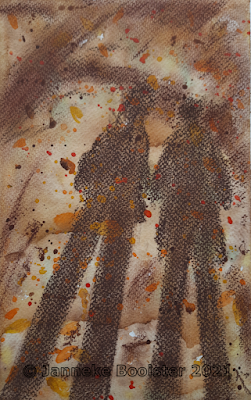
A few weeks ago my husband and me were walking in a nice forest area and I got inspired by the shapes of our shadows on the forest floor. I made a reference picture 'for later use'.

This month the challenge of 'Goed Gezien - Goed Bekeken' is 'the Walker', inspired by the fact that many people started going out for walks during the pandemic. (We already were frequently going out for walks in our beautiful nature, so nothing changed for us) The picture of our shadows on the forest floor was the ideal reference for this challenge so I started planning my work.

On a small piece of watercolour paper I made an under painting using the colours of the forest in autumn, brown, orange and shades of yellow and green. After this had dried, I added splatters of the same colours and let that dry again. Using two shades of brown Conté I added the shapes of the shadows that were cast by my husband and me but also the shadows of nearby trees and overhanging branches.

The structure of the paper is still visible in our shadows, I have blended the Conté into the paper and tried to create the blurry lines of the shadows cast by the trees and branches. 

The information about the materials I used, the size of this work and its availability can all be found in my Tumblr blog.

Sunday, 22 August 2021

Wild teasel


During our painting vacation, our teacher Ad van Aart took us to a natural side stream of the river Waal for inspiration. The views of the river, the riverbanks and the side stream were great and I made several pictures and some drawings for future reference, but I also saw a large Teasel plant and I made a reference picture to use with one of the abstract backgrounds I was working with during the week. 

For this mixed media work I made a relatively dark red background in which the earth pigments are dominant. This was done as a wash and the background dried quickly, so I could use it the same afternoon.

Using my watercolour pencils I made a drawing of the teasel plant, using the reference picture as my guidance. I could not fit the whole plant on the paper so I used the shapes of the stems, the flowers and the leaves to make a good composition. The large leaves and the flowers have several layers of colour, the stems and the smaller leaves have only one or two layers. 

The plant was already withering and some leaves had a dry straw-like colour on the edges. The small flowers were already gone, only the large flower heads remained. I have always loved this plant and wanted to paint or draw it, so I took my chance and enjoyed making this mixed media work.

The information about the materials I have used, the size of this work and its availability can all be found in my Tumblr blog

Wednesday, 18 August 2021

After the fire


During my painting vacation there was time for workshops, but also time to work as we wished to do. After I had used a picture of a skull last year to create a mixed media work, our teacher Ad van Aart brought some real animal skulls and bones with him this year for inspiration.

Drawing a skull from life is a bit different than using a picture, but I thought it clarifying . With a real skull in front of me, I can change my viewpoint to understand its structure which of course is not possible when using a picture.

The skull that inspired me is an animal skull found in Iceland and it belonged to a goat or sheep (that was not clear any more). I made a drawing using my watercolour pencils on a large sheet of paper and after this was finished I added trees with charcoal.  I decided to draw a burned forest, that seems to be the current state of a lot of forest areas.

These last weeks (months) there have been many forest areas on fire, mostly in the Southern parts of Europe, but also in North America and there is a huge fire going on in Siberia. These fires are alarming. I am not directly endangered by the fires or the smoke but the impact on the world climate is huge as we need the forests to cool down the  climate and slow down or even stop global warming, so I do feel uneasy about what's happening.

Now the mixed media work is finished, it seems to have become not only a drawing of a skull and a burned forest area. 

Something mythical has added itself to the atmosphere while I was working. 

These surprises are always welcome.


The information about the materials I have used, the size and availability of this mixed media drawing can all be found in my Tumblr blog.


Sunday, 18 July 2021

Sacred Lotus (Nelumbo nucifera)


Yesterday we went to Diergaarde Blijdorp for a visit to the animals and of course the flowers, trees and other plants, as this zoo is also a botanical garden. We are not often there in summer, but there had been a lockdown so we could not visit earlier in the year.
Of course we enjoyed the animals but we also needed a drink so we sat down on a terrace in the shade of a large parasol with a cup of tea. 

In a corner of the terrace were some pots with  Sacred Lotus (according to the information sign), mostly leaves and one large flower bud. Even though it was at a small distance, the flower bud and the leaves were clearly visible and I sketched them while waiting for the tea to turn cold enough to drink it.

Today I wanted to paint from my sketch, while the colours were still fresh in my memory and I decided to make a 'white on black' painting, using white gouache mixed with watercolour paints to paint the Lotus plant.

The flower bud was bright green and light yellow, so that was easy to paint, layering gouache that was lightly tinted with watercolour paint. The leaves are a dark green, with shadows  and these were not as easy. After one layer of tinted gouache I had to use only dark watercolour paint and that does not build up very well on black cardboard. In the end I used my watercolour pencils on the dried paint to suggest the cup - like shape of the leaves. These pencil marks are dry and do not mix with previous layers so that worked as I hoped it would.

The information about the materials I have used, the size of this work, its price and availability can all be found in my Tumblr blog.


Tuesday, 13 July 2021

The Red lantern


The July challenge of 'Goed Gezien - Goed Bekeken' had the Red Lantern for its theme. The red lantern is always on the vehicle at the end of a convoy - or the last cyclist in the race gets the red lantern to mark his unfavourable position.

The sports - related explanation of the theme did not inspire me, so I went through the archives and found a picture taken almost nine years ago in a narrow street in France. The lantern was high above us and because of the narrow street the picture had to be made at an unusual angle (for us). There was a very thick fog coming in from the sea which made the reference picture very special.

For my contribution to the challenge I have only looked at the perspective, made some changes to the amount of windows, added some lanterns and only suggested the trees and the fog in the background. 

Usually I try to change my style or technique when I paint or draw for a challenge and that is what I have done again this time. Well, maybe I have done this so often that this has become a 'second style' that is already customary for me.

The initial pencil drawing was coloured in with watercolour and I made sure I used a sketchy style. The paper is not really watercolour paper so I used as little water as possible to distribute the paint. The lanterns and some other details were drawn in using watercolour markers. I have used a little water to let the lines made by these markers flow where needed.

The information about the materials I have used, the size of this work and its availability can all be found in my Tumblr blog.

Sunday, 6 June 2021

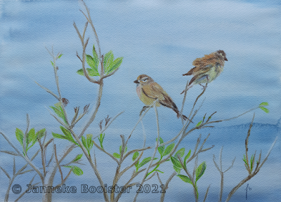
Common Linnets - Oosterschelde


During our walks along the shoreline of the Oosterschelde (Netherlands) we walked along some 'inlays' that were formed in areas where a break in the dyke was possible. A new dyke was made a bit more inland and the area between both dykes sometimes got flooded, sometimes stayed mostly dry land. These 'inlays' are now valuable and varied spots of nature, protected so we are only allowed to see them from the dykes that surround them.

One of those 'inlays' has a lot of breeding birds and at one place there is a birdwatcher's spot where we could look at the activity on the small (artificial) islands in the water. As it was springtime when we walked there, we had a lot to look at.

We were on the dyke and could not only see the water, but also the top of the bushes and small trees that were growing underneath the dyke in the protected area. These branches were frequented by some small birds and I asked my husband (who had the camera) to make some (reference) pictures. It was not easy, as the birds did not stay in one place for a long time, but he got me some nice pictures. 

One of the birds had been sitting there for some time, the other had just arrived and was arranging his (or her) feathers before settling for a rest. The background of the reference pictures is the water behind the dyke and the sunlit branches with the birds were standing out perfectly.

At first we thought - guided by the sound of skylarks - that these were the birds in the picture, but we were wrong. After comparing our picture with some references in books we concluded that these are common linnets. That is still special for us, as these small birds are not easily found where we live.

For this drawing I made a background in watercolour, because  that is the best way in which I could create the illusion of calm water in the background of the scene. Because I have used cellulose-based paper, I could not make my background as dark as the water looked in the reference pictures. Adding more layers of paint to that quality of paper only results in picking up all the paint that was already there and leaving white paper instead of a nice dark colour.

The branches and the birds are drawn with water-soluble pencils. Because the background ended up lighter than I hoped it would be, I had to make the branches darker than they were in the reference to stand out. My white pencil was not very visible on this background as it would be on a darker one. 

While making this mixed media drawing I changed and adapted my initial plans several times, depending on the results I got in each step of the process.

I did not apply any water on the drawing of the branches, as they are not the subject of my work. Only the drawings of the birds are 'activated' with a little water, so the colours would come to life. The result is what I hoped it to be.

The information about the paper, paints and pencils I have used, the size, the price and availability of this work can all be found in my Tumblr blog.


Monday, 29 March 2021

What to choose...


The theme of this week's challenge (Travel) brought up the best - or worst - in me and this is the third work I have made inspired by this challenge and the description of its theme.

The announcement included the suggestion that we might travel again after this winter - and the lockdown - and we are challenged to draw or paint our favourite destinations.
That is where the stress begins!

For this drawing my husband helped me to print a photocopy of a map showing my hometown and a bit of the surrounding area. Rotterdam, a bit of the Port of Rotterdam, the old town of Dordrecht and our Natural Reserve 'De Biesbosch' are also visible on the map.

The options for a vacation are innumerable but my favourites are on the arrows on the directing post. I have guessed the direction of each destination and made the arrows so that the name should be legible. The direction post stands where my house is situated in our home town - this is approximately of course, the map is not that detailed.

The challenge is only for a week, if I had more time I would have put in much more effort than I could do now. It still was fun thinking about this one and making it - even in so little time.

The information about the materials I have used, the size of this work and its availability can be found in my Tumblr blog.

Saturday, 27 March 2021

Memories of Honfleur


This week the theme of the challenge is about 'Travel' and we are asked to paint, draw or sketch our favourite destinations for a vacation. Of course there are many favourites but I thought it wise to choose a destination that can be recognised by an international jury.

So I thought of a sketch I made over ten years ago, sitting behind a cup of coffee in Honfleur. This little church is between two large buildings and on the side of the harbour. The water here usually is very low, so only the tips of the masts are visible.
Honfleur is a small town without much colour, there is a lot of grey stone used to build it. 
I added some colour to the buildings next to the church, which is really mostly grey with some touches of colour.

I have used my markers again - a line marker and my watercolour markers, combined with a wet brush for the washed effects. This is a technique I want to use more often, after my first experiment I really enjoy working with these materials.

The information about the materials I have used, the size of the drawing and its availability can all be found in my Tumblr blog.

Friday, 22 January 2021

Red Panda - a mixed media drawing


Last December we made the best of the weather and we visited 'Diergaarde Blijdorp' on a nice Saturday. There were lots of restrictions due to the Covid pandemic, but the animals were there and those that like the colder weather were outside. 

One of my favourites is the red panda (Ailurus fulgens) and when it was walking outside I made some pictures, hoping for the best. This one was the best, the other pictures had the panda with its head in the other direction, so the face was not visible. This picture was not perfect either, the panda was walking so there are some parts that are not as clear as I hoped them to be.

For this one I decided to make a mixed media drawing, using watercolour for the background and the big trees where the panda usually goes for a good nap. I also added the tree stumps and some bushes behind the red panda.

I left the shape of the red panda white (not painted) and used watercolour pencils and Graphitint pencils to draw the walking panda, the grasses, herbs and fallen leaves on the ground.

The paper I have used has some structure and that is still visible where I used my pencils.

Once again the conclusion has to be that I need more practice, but I have no problem with that. I love red pandas so when the Zoo can reopen (after lockdown) I will certainly be back to make more reference pictures and in warmer weather I make sketches on the spot.

The information about the materials I have used, the size and availability of this work can be found in my Tumblr blog


Sunday, 17 January 2021

Reed lands


Another challenge was announced a few days ago: Artists and Illustrators Magazine has started a 'Lockdown Drawing Challenge' again, with a new theme every week. This first challenge has 'lockdown walks' as its theme and I made some reference pictures during a walk close to my home, in the park 'Noordhoekse Wiel'. In this time of the year, the most prominent feature of that area are the reed lands, with reeds that are higher than I am and some bare trees and bushes standing between them.

For my 'lockdown drawing' I made a watercolour underpainting with the colours of the sky and the shapes of the distant trees and an indication of the shadows in the foreground.

After that had dried, I used my pencils to draw the tree and bushes between the reeds and the reeds themselves. In the foreground are reeds that were broken and lying on the ground, I have used a lot of different colours for the stalks of the reeds to indicate a wide row of reed plants. Of course I added more shadow colours until I had so many layers of pencil that I could hardly add another colour.

After I had made my reed land as dense as I could achieve, I started adding the plumes and the last details to the tree branches and to finish it all I used some fixative.

The information about all the materials I have used, the size and availability of this work are all in my Tumblr blog

Thursday, 31 December 2020

The mud flats of Voorne in winter - a charcoal drawing


When we were walking along the mud flats of Voorne a last week, I made several reference pictures and I also made and posted a watercolour painting. In that blog post I mentioned that there also was a lot of grey in the landscape and I would do a charcoal drawing after another picture of the views we had.

This is not a charcoal drawing on a white background, as I had in mind when I wrote that. Instead I have chosen a sheet of watercolour paper with more structure than the paper I usually use for my charcoal drawings and I made a blue watercolour underpainting as a base for the drawing. The paint is not applied evenly but there is a gradient from top to bottom.

On that blue background the willow charcoal turned out a bit too black to my taste so I added some hints of colour to the mud flats and the dunes on the horizon with my Tinted Charcoal Pencils. 

Using my fingers and a piece of tissue paper to blend the colours finished this drawing, the last one of this year.

The information about the materials I have used, the size and availability of this drawing can be found in my Tumblr blog

Thursday, 10 December 2020

Gold, frankincense and myrrh


This year the December challenge of 'Goed gezien - Goed Bekeken' is Gold, frankincense and myrrh which are the gifts of the three Kings - or Three Wise Men to the new born Jesus.

Of course these gifts symbolise much more than a present for a new born baby, they also stand for the positions of King, Priest and Prophet that were to be the future of Jesus. Another explanation is that these gifts are what is needed for a funeral; myrrh for embalming, frankincense for a nice aroma and gold to pay for all other things.

The three kings themselves symbolise the three continents Asia, Africa and Europe and that can be found in the shapes of their head coverings. Some imagination is needed here because I have only painted the outlines of the three kings, wrapped in cloaks.

The star had to be there as well, I would not forget that and its light shines on the scene in the night. The little manger is there also, a bit of cloth hangs out and this suggests that the gifts are already given and the three kings stand aside (wise as they are) so they will not wake the sleeping baby. 

For this work I have used my heavy black cardboard again and my white gouache, all the colours are done with a variety of pencils.  Deciding about my composition was not easy for this one, I had some help from my mother to establish the proportions.

The information about the materials I have used, the size and availability of this work can all be found at my Tumblr blog.

Tuesday, 27 October 2020

Autumn Leaves - mixed media drawing


During the last week - our short vacation in one of our Natural Reserves - the colours of the trees were changing from green to autumn. We passed by a lot of beautiful trees during our walks and the area where we had our vacation home also had lots of trees that were in autumn colours. The most beautiful ones were those of the northern red oak (Quercus rubra) that was introduced in Europe about two hundred years ago as a decorative species.

Of course I wanted to paint in these colours, but I did not bring all my paper with me, so I decided to make an orange underpainting with watercolour and make a nice drawing of some of the leaves with my water soluble pencils. 

The composition was made using more than one reference picture and I have used the watercolour quality of my pencils to make the leaves even more colourful. After the first layer of pencil, I used a bit of water to intensify the colours used. 

After that had dried, I added more layers of pencil until I was happy with the result.

The information about the paper, paints and pencils I have used for this mixed media work as well as the size and availability can be found in the link at the 'Galerie' page of my website www.jannekesatelier.webs.com

Sunday, 18 October 2020

In the woods


This year is a year for mushrooms, they appear everywhere and most of all in beautiful pictures on tv shows. So of course I am inspired to paint and draw mushrooms and this time I have been looking in my archives of reference pictures.

The picture for this mixed media drawing was made several years ago and I still did not paint from it, because the mushroom (I have been looking for its name, but I still have no idea what kind of mushroom it is) is grey, almost translucent. It reminds me a bit of a jellyfish with the lines going to the middle and the semi-transparent quality of the hood.

Then I remembered I could do a drawing with my Conté Sketching Crayons, as there is a grey one in my set. I have added some more colours from the set to this drawing and I tried to add some more colours with my Graphitint pencils and a Tinted Charcoal pencil. After spraying fixative, the colours of the pencils dominated the grey hood, so I added more Conté to it, fixative again and repeated these steps one more time. The Graphitint is more dominant than I expected,  I have learned a lesson for the next time. 

The forest floor, with branches, some feathers and pine needles is only suggested here by layering Conté Crayons (smudging them with my fingers) and pencils until I had the desired result. 

This time I worked on coloured cardboard, this is a heavy paper and I have chosen a small size, because I had only one mushroom as my subject. For a group of mushrooms I would have chosen a larger sheet of paper of course.

The information about the paper, pencils and crayons I worked with, and the availability of this drawing can all be found in the link at the 'Galerie' page of my website www.jannekesatelier.webs.com