Sunday 26 December 2021

Peek a boo!


Very often my husband and me make a walk a in our neighbourhood passing some streets before making a small round in the park and returning home through some other streets. One time we walk clockwise, another time counter clockwise and we do not always walk the same streets to have a different route as often as possible. We pass by a lot of gardens and also there are small areas with low bushes that are maintained by the public services of our home town. 

During one of these walks I saw a black and white cat trying to hide in those bushes but as it was late in autumn, there were not many leaves left to hide behind. It was a very nice scene, so I politely asked permission to make some reference pictures. The cat did not walk away (as they often do in such cases) and even took a more beautiful pose for the picture. Of course I said 'Thank you very much' before walking on.

For this drawing I have used my Tinted Charcoal Pencils, they have the right colours for an end - of - autumn scene and my model has the white of the paper and the black of one of the charcoal pencils that are included in the set.

The information about the materials I have used for this drawing, its size and availability can all be found in my Tumblr blog.

Monday 20 December 2021

Dark clouds over...


Very often there are the most beautiful dark clouds in our sky, especially when you are inside. On one occasion there were only clouds (no rain yet) late in the afternoon and I went out to make reference pictures. The first picture I made also showed the light of the shed in the back of the garden and its reflection in the window of the shed's door. That light reacts to a motion detector and my leaving the house did the trick. I decided to use that picture as my reference for a watercolour painting.

Of course my pictures were not very good, the clouds are perfect, but the visible part of our (small) garden are only dark shapes. For the painting I looked outside for reference and combined that with the atmosphere of the reference pictures. 

Getting the fence right (perspective, vanishing points etc.) was not easy and I am still not confident that I did get it right, but as not many of those that read this post will be visiting my home to check I just post the painting as it is. The fence is old and weathered and I am happy that I did paint that characteristic as true to reality as possible.

The atmosphere created by those dark cloud are my real subject and the result is as I hoped it would be.

The information about the materials I have used, the size of this watercolour painting and its availability can all be found in my Tumblr blog.


Sunday 12 December 2021

Village church - Sauerland


The reference for this watercolour painting is a sketch I made over nine years ago during a vacation in the Sauerland, Germany. I needed a Facebook challenge about painting churches or chapels to find this sketch again and make a painting.

For this painting I changed the season to a snowy scene in winter - at least I hope this is what a snowy day in winter looks like in the Sauerland. I live in a very flat country and do not really know how high hills (or low mountains) look like in winter. 

The sketch I made all those years ago was very limited, it only showed the church, one other building and lots of bushes and the lines of the hills in the background. Such a limited sketch allows for a lot of 'artistic licence' when making the final painting.

Using a limited palette and a lot of the mentioned artistic licence I made the painting I wanted to make.

The information about the materials I have used, the size of this watercolour painting and its availability can all be found in my Tumblr blog.

Monday 6 December 2021

The walkers


A few weeks ago my husband and me were walking in a nice forest area and I got inspired by the shapes of our shadows on the forest floor. I made a reference picture 'for later use'.

This month the challenge of 'Goed Gezien - Goed Bekeken' is 'the Walker', inspired by the fact that many people started going out for walks during the pandemic. (We already were frequently going out for walks in our beautiful nature, so nothing changed for us) The picture of our shadows on the forest floor was the ideal reference for this challenge so I started planning my work.

On a small piece of watercolour paper I made an under painting using the colours of the forest in autumn, brown, orange and shades of yellow and green. After this had dried, I added splatters of the same colours and let that dry again. Using two shades of brown Conté I added the shapes of the shadows that were cast by my husband and me but also the shadows of nearby trees and overhanging branches.

The structure of the paper is still visible in our shadows, I have blended the Conté into the paper and tried to create the blurry lines of the shadows cast by the trees and branches. 

The information about the materials I used, the size of this work and its availability can all be found in my Tumblr blog.

Sunday 28 November 2021

Deelerwoud - moorland


A few weeks ago we (my husband and me) were for two nights in a hotel so we could go for some nice walks in our Natural Reserve 'De Veluwe'.

Our first walk was in the 'Deelerwoud', a beautiful part of the Veluwe and also protected. The walk passed some moorlands and we used a shortcut between the 'large' and the 'small' moorlands. Halfway that shortcut were some large trees and some benches for tired walkers at a viewpoint.. As it had been raining recently we did not sit down, but we enjoyed the view and I climbed on a fallen tree trunk to make some reference pictures. 

Because I was under the trees, some low branches are in the picture as well. These foreground branches are perfect to show the distance of the trees in the background. The foreground has mostly yellowed grasses and in the middle ground a bit of the moorland is visible, dark now that the plants have lost their flowers. 

The cloudy sky only adds to the autumn mood - it had been raining lightly during our walk - and I really wanted to paint this scene, the colours of this beautiful landscape were really wonderful and I do want to visit that area again.

The information about the materials I have used, the size of this watercolour painting and its availability can all be found in my Tumblr blog.


Sunday 14 November 2021

Light


Winter is coming, so the November challenge of 'Goed Gezien - Goed Bekeken' is OverWinter(ing). That can be about going to a warmer climate for the winter months or about going out and coming back to hot chocolate and other comfort food or.... what may inspire us.

All those activities have in common, that we are looking for the light, because these are dark months with shortening days and grey skies. 

So I remembered a very old picture made by my daughter Mariska which shows a lot of candles burning in a church (or cathedral) in which the light and warm colours of the candles are a beautiful contrast to the cool colours and darkness of the building.

Of course I have simplified the scene a bit for my watercolour painting, but the idea is still there; the warmth of the candle light contrasted by the grand, dark building. 

The information about the materials I have used, the size of this watercolour painting and its availability can all be found in my Tumblr blog.

Thursday 11 November 2021

Dead tree - watercolour and pencils


More than a week ago my husband and me were on a very short trip to our Natural Reserve 'De Veluwe' and we started with a morning walk in the  Deelerwoud. After the rain had (not completely) stopped we had a great walk with beautiful views. We even saw some deer that were too fast to be photographed but we do have the memory.

Not far from the starting point of our walk we saw a really big dead tree, still standing as if nothing was wrong. Because there was no bark left we could not determine what tree it was, but it probably was an oak tree - looking at the shape makes that very plausible.

My husband had already made the picture before I could ask him and of course I wanted to paint that tree. And that is exactly what I did not do.

Because the tree was lighter in colour than most of the background I would have to paint around it and so I decided (also inspired by our current climate crisis) that I would paint around the shape of the tree and leave that negative shape as blank as possible.  I could either leave it untouched or add some pencil marks if the painting 'asked for it'.

After the painting was done I decided that the pencil marks would add to the result so I used three colours of my water soluble pencils to accentuate the shape of the tree and the branches. The tree still looks very much like a negative presence and that is what I wanted it to be.

The information about the materials I have used, the size of this work and its availability can all be found in my Tumblr blog.


Tuesday 2 November 2021

Mushrooms - a drawing


We were on a very short vacation - only two days in a hotel near our Natural Reserves on the Veluwe and we made some nice autumn walks in our very beautiful nature. There have been wonderful views, beautiful trees, some deer that were too quick for the camera and of course mushrooms.

To the hotel I only brought my drawing materials (paper and pencils) and I used these to make a drawing after one of the pictures my husband made. 

Out of a dark, wet fallen tree trunk come some shining mushrooms that capture the light beautifully. On the tree trunk there is a fallen leaf in orange and yellow shades, adding some colour to the scene.

Using my pencils, I have layered colours to get the result I wanted, carefully avoiding the white, reflecting hood of the mushroom. The cracks in the tree trunk were really dark, especially after the rain of that morning. 

The result is what I hoped for and I had a good time drawing this mushroom.

The information about the materials I have used, the size of this work and its availability can all be found in my Tumblr blog.


Thursday 28 October 2021

Nighttime conversations


When the end of October is near the challenges (mostly on Facebook) are about ghosts, spooky things and so on. It took a long time (and some conversations with relatives) before I had the inspiration to paint this watercolour painting.

My daughter suggested a misty forest, I thought about a spider and its web and my mother added the idea of a black cat. All that combined would make a nice scene for me to paint. Most of this is completely imaginary, only for the cat I have used one of my own reference pictures. 

For the spider's web I have used a small white wax crayon, so the lines would resist the watercolour. Not all the wax lines did resist the watercolour though so in the end I added some lines a bit with small amounts of black paint. The result is suggesting the white lines are shimmering in a beam of moonlight. 
The black cat I was painted using a mix of black and a greyish blue colour as animal fur always has variations in its shade because of the light. That suggested beam of moonlight will also have touched the cat so I had to include that in my depiction of the cat.

I have enjoyed painting this little scene and I was happy to have experimented with wax resist again - there is a lot to learn with that technique.

The information about the materials I have used, the size of this painting and its availability can all be found at my Tumblr blog.

Tuesday 26 October 2021

Iceland - Autumn colours


Of course the nature in our own country is very beautiful, but sometimes I want to paint something different, if only because that is a challenge for me that helps me improve my skills.

This time I got inspired by a documentary about Iceland and its nature and I wanted to paint that. My memory of the scene had to help me while I was sketching and later while I was working on my watercolour painting. 

Iceland is very volcanic and this scene showed a stream flowing in a typically volcanic rock formation. The lines of the black rock or solidified lava are beautiful visible and all I had to do is paint... Of course it's not that simple. 

Solidified lava is very black and usually watercolour artists don't use much black in their paintings, as the colour is 'not natural'. This time I decided to use Ivory Black for the rocks and as that has a slightly brown shade I added a light blue to create the colour I needed. There was a lot of light falling on the lava rocks so I left patches of white, added some blue and made the shadow parts as dark as possible.

The vegetation growing in that landscape (probably mosses) are showing brownish orange autumn colour with bits of red and patches of brown and that was mostly painted wet-in-wet.

Painting this landscape - without any trees in it - was a small challenge and an experience that I liked very much. The result is even better than I hoped to achieve.

The information about the materials I have used, the size of this watercolour painting and its availability can all be found in my Tumblr blog.

Wednesday 20 October 2021

Cedar cones - a white on black painting


During a nice forest walk in the 'Kaapse Bossen' we made pictures of mushrooms, of trees and of each other and we were looking out for 'Christmas Card inspiration'. We were looking for pine cones, larch apples or any other combination of needles and the fruits of the same tree and high up in a tree we could see some cones that were as good as white.

My husband (who had the camera) made some nice reference pictures for me and I have been thinking about 'how to paint these' because the background was very blue and that would not do for a Christmas card. After some thinking I decided to paint these white cones and some of the branches they were in on a black background, using a combination of white gouache and watercolour paint. 

Working on a white paper and painting a blue background using watercolour would mean that the cones would not stand out so beautifully as they did when the reference picture was made.

The black background unfortunately means that this painting will not be used for a card as the printing companies cannot handle all that black.

Zooming in on the picture revealed that the cones were not all white, but a shade of beige with a lot of white resin which created the white appearance from where we were standing. It was a tall tree, so we could not see details from ground level. I chose to paint them white, using a shadow colour to create the characteristic shape of the cones because that was what did attract our attention and gave me the inspiration for this painting.

The information about the materials I have used, the size of this work and its availability can all be found in my Tumblr blog.

Sunday 17 October 2021

Larch twig


During an autumn walk in our beautiful nature I already was looking for inspiration for this year's Christmas Card. I was looking for pinecones on a branch with some needles as well, but these were all high up in the trees and not easy to photograph. 

Somewhat  lower than where most pinecones were to be seen I found this little larch twig with needles and larch apples. This was also good for what I wanted so I picked it up from the ground (no tree was harmed in the process) and as I held it, my husband made several reference pictures for me.  After that I put it back where I found it and looked further for more inspiration - which I found and will be the subjects of later paintings.

From the pictures that were made I selected the one I liked most and made this watercolour painting on a small size paper. As the twig was my subject I made a light blue background and made a drawing of the most important lines of the twig using a water-soluble pencil. After that I painted the twig carefully, with as little water added to the paint as possible.

The information about the materials I have used, the size of this watercolour painting and its availability can all be found in my Tumblr blog.


Friday 15 October 2021

Autumn in the foreground


For this month's challenge I had to paint for the theme "My little sister can do that too" so there was a bit of thinking before I could even find any inspiration. The theme is the same as this year's School Art Project of 'Goed Gezien - Goed Bekeken' and we have to try to paint like little children. Not an easy task...

Looking back to my painting vacation I decided to make an abstract background with poured watercolour, using two shades of blue. It took some time to dry, this time I made my background indoors and with lower temperatures. I have also chosen to use a different quality of paper, adding another uncertain factor to the experiment.

During a short walk I picked up two autumn leaves in different sizes and I drew their outlines with pencil on the dried background. Using some autumn colours I painted the leaves, letting the colours mix on the paper. The blues of the background also mixed with the colours of the leaves. On this paper that happened easier than on the cotton paper I used last summer. 

After this had dried (with a little help from my hair dryer) I added another layer of leaves, outlining them with a pencil and filling the shapes with two shades of Graphitint pencils.

If I had a little sister, she probably could do this too, but I am not certain if I have painted like a child. I did have fun though, maybe that counts as well.

The painting was not really planned in advance, I started with the blue poured paints and the leaf shapes, placing the leaves on the surface and creating the final composition happened while working. The pencil layer was added to cover the white of the paper without adding more colour that would have been 'too much' and ruining the nice composition of the painted leaves.

The information about the materials I have used, the size of this work and its availability can all be found in my Tumblr blog.


Sunday 3 October 2021

Megalith - another watercolour painting


In my previous post I mentioned that I wanted to know what would be the difference between rough paper and paper with a smoother texture. So today I have painted the same scene, using the same colours, on a different paper. Both paper are cotton papers of the same weight and the same brand so the only difference is the texture. And maybe the conditions of the room I use as my studio (temperature, humidity of the air) and my being more or less relaxed while painting.

The difference is mostly in the sky and clouds where I wanted to paint wet-in-wet for nice colour transitions and tonal differences. The clouds had to be dark and I achieved more darkness than I dared to risk yesterday, but the brushstrokes matter much more on this paper than on the rough paper. I spent a lot of time and energy trying to correct that ending with a painting that is almost overworked.

The colour difference in the foreground happened because I did make some changes in how I applied the colours. More blue near the horizon and just a little brown in the foreground. Because of the texture of this paper I could add some more details without ruining my nice wet-in-wet foreground.

The stones are painted with less paint and corrections. That worked well for the small one on the right, but the standing stone might have been a bit darker.

Both watercolours are different and that was to be expected. In both paintings are some things that could be improved and in both paintings are things that are very good. The conclusion of this weekend is that because of the difference in paper texture both paintings cannot really be compared and have to be judged for their own value.

This painting also 'works' well so I am happy with today's result. Now I will not wonder 'What if I had....'  anymore and I can move on to other subjects.

The information about the materials I have used, the size of this painting and its availability can all be found in my Tumblr blog.


Saturday 2 October 2021

Megalith - watercolour painting


As written in my previous post, I have also made a watercolour painting using the sketch I made inspired by a documentary about megaliths.

There was time to select a sheet of paper, soak and stretch it, let it dry and paint so this is the result of today's work. The paper I chose has a rough texture which stays wet or moist much longer than smoother papers so the colours can blend beautifully as is required for the clouds and the grassland. Painting details on rough paper is more difficult because of that same quality so this watercolour painting is much less detailed (compared to the charcoal drawing) because adding more detail would definitely have ruined the foreground. 

In fact it is 'not fair' to compare a watercolour painting to a charcoal drawing, the charcoal can get much darker - almost black - than watercolour, even if I apply several layers of paint. Using the fine structure of the paper, a lot of details can be suggested with a stick of charcoal which is not easy using wet paint on a wet or moist sheet of watercolour paper.

Maybe I should paint another watercolour on paper with a finer texture, so I can see the differences between the two watercolour paintings. That should be a much better  comparison than when I look for the differences between two techniques that are based on very different materials.

In fact I am really happy with the results of today's work, 

The information about the materials I have used, the size and availability of this watercolour painting can all be found in my Tumblr blog.

Wednesday 29 September 2021

Megalith - charcoal drawing


This charcoal drawing does have a very unusual source of inspiration, a documentary about megaliths do be precise. There were some wonderfully atmospheric landscape shots in the documentary and I started sketching the one that made the strongest impression as soon as possible to remember that landscape and atmosphere.

My sketch does have a lot of notes - as usual - and I wanted to work from that sketch even before I had the time for a watercolour painting. Watercolour painting needs some preparation because the paper has to be soaked, stretched and dried again before I can start painting.

A charcoal drawing is quick because I only have to gather my materials and start drawing. To recreate the atmosphere of the scene in the documentary a charcoal drawing is perfect as although there was some colour in the scene the dark clouds and the solitude of that one standing stone made that me want to draw and paint.

Of course I am not finished with this scene now, there will also be a watercolour painting - when I have the time to prepare and paint properly.

The information about the materials I have used, the size of this drawing and its availability can all be found in my Tumblr blog.

Sunday 26 September 2021

Weeping willow - Autumn colours


It has been a while since I painted an imaginary landscape with the little weeping willow in it, so I made one today.

There are three weeping willows in this painting, the landscape may be imaginary, yet I wanted to paint a scene that might be realistic. So there are three trees on the bank of a pond that is situated in a small parc in a town. The town's buildings are suggested in the background. There may be a path in the parc and there are reeds in the pond.

As autumn is very very near, I wanted to paint the autumn colours of a weeping willow and I added a strong wind to complete the autumn mood. The leaves of a weeping willows turn yellow before they fall and turn brown so I have used several shades of yellow and a brown to paint the foliage that is still on the trees. Some leaves are already blowing in the wind, I have splattered paint to suggest that. The reeds are also bending in the same direction.

To suggest the reeds I have not only used a very small, almost dry brush with some of the colour mixes that are also used for the grass, but in addition to that I have used some watercolour sticks in their dry form to draw some sharp lines. Some of the lines in the trees are also a yellow watercolour stick.

The watercolour sticks are pure paint of the same quality that comes in pans and used with a wet brush there is no difference between the paint from a stick and the paint from a pan or tube. These sticks can also be used to draw lines and I like that idea very much so I have a few of these sticks in shades that can be used in landscape paintings.

The information about all the materials I have used, the size and availability of this watercolour painting can be found in my Tumblr blog.

Thursday 23 September 2021

Autumn Colours - a tinted charcoal drawing


During a short walk very close to our home - we did not leave our hometown - we could see the colours on the trees and bushes already changing. I made reference pictures of a branch of common dogwood (Cornus sanguinea) with leaves that were having a nice shade of purple before turning to a reddish brown. The berries were looking great as well, though they were mostly in the shadows they had a nice glow.

For this drawing I selected a sheet of coloured carboard in a shade of green that was as close to the colour of the bushes in the background and I started drawing with my Tinted Charcoal pencils. 

To draw the leaves and berries I layered different colours as much as possible, sometimes blending them and adding another layer of lines. This process was repeated with all the leaves and berries until the drawing looked like what I wanted it to look like - or as close to that as possible. To indicate the background leaves and shadows I added some shapes with the 'neutral' coloured pencil.

The information about the materials I have used, the size and availability of this drawing can all be found in my Tumblr blog.


Saturday 18 September 2021

After sunset - harbour mouth


Last summer we went for a walk along the beach at the time of sunset and I have already made several watercolours using the reference pictures I have made that evening. After sunset we drove a bit further to see the harbour mouth, or the entrance to the Port of Rotterdam. We still were on the Maasvlakte.

At that time the tide retreated so there were not many ships in sight. Those that were visible were little spots on the horizon.

Much better visible are the Southern or Green harbour light on the side of the Maasvlakte and far away the Northern or Red harbour light on the Pier of Hoek van Holland. These colours could not be seen any more when we were there, it was too dark and they were back lit by the colours of the sunset.

The sun was already behind the horizon but the colours in the sky were still great. It was a calm day and we were very lucky to have such great views. This very calm atmosphere is what I wanted to paint this time and I chose a paper with a rough texture, so the colours of the sunset could blend better than they would have on paper with a finer texture. Because the scene was back lit, the foreground and the rock structure under the harbour light are dark masses without contrast or shadows. Both are made out of basalt blocks but that cannot be seen in the light conditions of the moment I was there.

As said, I wanted to paint a very calm after-sunset mood and I am happy with the result.

The information about the materials I have used, the size and availability of this watercolour painting can all be found in my Tumblr blog.

Saturday 11 September 2021

Church on the river - winter mood


The little church on the river Waal did inspire me to paint it in more than one composition, as I wrote in my previous post. In that post I also wrote about the church itself and why I decided to paint it more than once.

This time the reflections in the river are not important for my composition, instead I painted the church in a winter mood using the colours of the sky to get that particular atmosphere. Of course I could have painted a very dramatic skyscape, but our winters often have very calm days with only a few clouds in the sky that disappear within a few hours after sunrise. 

That was the calm winter mood I wanted to paint and I chose my colours carefully. The trees are bare now so there is a tangle of branches in different shades of brown. The bushes, both beside the church as well as in the foreground are more dense and I chose different shades for them. The riverside still has the dyke but most of its vegetation is resting in winter, only some bushes and shadows are visible. There is a reflection in the river, but that is not the most important part of this composition, so it is only suggested with a minimal amount of colour.

It is a winter morning and the lights in the church are on - maybe it's a Sunday, maybe the volunteers are cleaning up or decorating for a festivity, everything is possible.

Painting a winter scene from imagination while it's end of summer (all the trees I can see from my window are still green and the sky is mostly grey) is challenging but I am really happy with the result.

The information about the materials I have used, the size of this watercolour painting and its availability can all be found in my Tumblr blog.

Saturday 4 September 2021

Church on the river


During my painting vacation we went to the river Waal for inspiration. We stayed a few hours to make sketches and pictures for future reference. Last painting vacation I did chose a theme for myself and I used the picture I made of a wild teasel for a drawing.

Of course there was more to see than only a wild teasel and I have made reference pictures and sketches inspired by the views of the river and a side stream with beautiful trees and bushes. On the other bank of the river I could see a small church - when I was in the right spot - and I made a sketch of that church as well. It was too far away for a picture, so I only have the sketch and my memories of the scene. I have tried to find the church on a map and I found that it is in fact very far from the riverside. To compose a landscape using the sketch as my guide I will have to use the church, the trees and bushes behind it and a bit of the dyke in front of the building and create an imaginary scene with these elements.

When I was there, it was still summer, with a blue sky and the trees and bushes were in shades of green, hardly distinguishable from each other. The paintings I want to make will have the colour scheme I feel like at that moment and I will be using the black-and-white sketch to determine the proportions of the church, the trees and the bushes I have been drawing.

Today I wanted to paint after that sketch and I have chosen to paint some reflections in the river as well, so the horizon is high in my composition and there is a lot of room for the water of the river.  I wanted some colour in my painting so I have made an imaginary autumn scene.

The results are what I hoped for - and even a bit better - so I will make more paintings using this sketch as my inspiration.

The information about the materials I have used, the size of this watercolour painting and its availability can all be found in my Tumblr blog.


Saturday 28 August 2021

Kalmthoutse Heide - August


Now is the time of the year that the heather is in bloom so we went for a walk on the 'Kalmthoutse Heide', a protected Natural Reserve that is mostly in Belgium but crosses the border with The Netherlands in the Western parts of the Reserve. Because of the various lockdowns we had over the last year and a half, we had not visited the Kalmthoutse Heide for a long time.

We made the signposted walk that was our first in that area and we could see some differences - nature did not really suffer during the lockdowns. Of course I made several (reference) pictures of the heather in full bloom and some other nice views.

One of these pictures is used for this watercolour. The clouds were really dark, we had rain twice during the walk and because of the grey sky the trees also looked like dark shapes without much contrast. Of course I did not paint every little flower on every patch of heather, I prefer to paint an impression of the landscape and the viewer is welcome to imagine the details. 

The information about the materials I have used, the size of this watercolour painting and its availability can all be found in my Tumblr blog.

Thursday 26 August 2021

They fell too early....


The chestnut tree in our garden had a lot of flowers this spring and there were many little chestnuts growing on the branches of the tree. Usually there are more little chestnuts than the tree can feed so over time some fall. That begins at the end of spring and it will end in a few weeks. The ones that are still in the tree by then will grow to be beautiful large chestnuts.  

What falls now is at least three to five centimetres in diameter and when they open, a very little chestnut is already inside.

For this watercolour painting I have dripped some paint on a stretched watercolour paper, like I did during my painting vacation,. This time the paint I used was not very concentrated so it would dry faster (I work indoors now) and it could also be painted over without disturbing the background layer. 

On my background I have made a composition of chestnuts still inside their husks and some of the empty husks, that have opened after drying. Some are exactly the right size, but most of the chestnuts are painted larger than life. The fallen chestnut shells dry quickly and turn (dark) brown so I used the real colours of my subjects to paint them. Adding shadows to these dark brown colours was not easy, but I managed to suggest their round shapes and add some depth to the composition.

The information about the materials I have used, the size of this painting and its availability can all be found in my Tumblr blog.

Tuesday 24 August 2021

Diergaarde Blijdorp, Rivièrahal


New months keep coming and it's time for the August challenge of 'Goed Gezien - Goed Bekeken' which is about Monuments.

Of course I can go looking for castles and that kind of buildings, but I have some favourite monuments that are not the obvious choice.

In Diergaarde Blijdorp (Blijdorp Zoo, Rotterdam) are 21 listed monuments and the Rivièrahal is one of them. During a visit to the Zoo my husband made some nice reference pictures for me and I decided to paint this scene, the back entrance with on the right the entrance to the indoor accommodations of the black rhinoceroses.

To keep the monumental atmosphere I painted a monochromatic Sepia watercolour. The round shapes of the buildings are still a challenge in itself, but I am happy with the overall result.

The information about the materials I have used, the size of this watercolour and its availability can all be found in my Tumblr blog.

Monday 23 August 2021

Branch patterns


This is the last work I made during our painting week, still using an abstract background and painting on top of that. Our teacher Ad van Aart asked me to paint only branches on a background, in a way that the trees would not be in the painting - going as abstract as possible for me after this week.

This time I chose a blue background, simply because the other colour choices did not seem 'right'. The branches had to have a contrasting colour and yellow or orange do limit the choices in contrasting colours very much - only a very dark blue or brown are options on such a background. Using a blue background I could still chose brown, but also a dark red or violet and even a dark green.

For this painting I decided to use another earth colour with a violet shade that could be light when using a lot of water or very dark and opaque with just a little water to paint easier.

Because the trees were to be out of sight I painted large branches coming in from all directions and added smaller branches - using a smaller brush - to the composition of the large ones. While at work I decided to use one of the lighter spots of the background to show a glimpse of that background - or sky - and make the branch pattern a little less dense around it.

While painting I have used other line patterns for my branches than I used in the 'Trees in the foreground' paintings (which have sharp angles), the branches in this painting have rounded curves and angles.  Filling the whole paper like this was a lot of work, in the end it became almost meditative and I enjoyed working like this very much.

The information about the materials I have used, the size of this watercolour painting and its availability can all be found in my Tumblr blog.

Sunday 22 August 2021

Wild teasel


During our painting vacation, our teacher Ad van Aart took us to a natural side stream of the river Waal for inspiration. The views of the river, the riverbanks and the side stream were great and I made several pictures and some drawings for future reference, but I also saw a large Teasel plant and I made a reference picture to use with one of the abstract backgrounds I was working with during the week. 

For this mixed media work I made a relatively dark red background in which the earth pigments are dominant. This was done as a wash and the background dried quickly, so I could use it the same afternoon.

Using my watercolour pencils I made a drawing of the teasel plant, using the reference picture as my guidance. I could not fit the whole plant on the paper so I used the shapes of the stems, the flowers and the leaves to make a good composition. The large leaves and the flowers have several layers of colour, the stems and the smaller leaves have only one or two layers. 

The plant was already withering and some leaves had a dry straw-like colour on the edges. The small flowers were already gone, only the large flower heads remained. I have always loved this plant and wanted to paint or draw it, so I took my chance and enjoyed making this mixed media work.

The information about the materials I have used, the size of this work and its availability can all be found in my Tumblr blog

Saturday 21 August 2021

Trees in the foreground - 2


After the first abstract background with trees in the foreground I wanted to make a second abstract background with something in the foreground. So I selected another set of colours, preparing and pouring them in the same way as I did with my first painting in this technique.

Again it took several hours to dry and in this case I had to wait until the next morning before I could continue with the foreground. I had not decided yet, after a short conversation with our teacher Ad van Aart it was decided that I would paint trees again, but with a different contrasting colour and different shapes. The amount of trees has changed as well.

With this painting I have also suggested some depth in the tree line. The trees that are really in front of everything have at least three layers of paint, so the background colours are almost covered. The chosen contrasting colour for the trees is a little opaque and I have used this quality as good as possible. 

The result is different from the first painting, but that was intended and I am happy with both experiments. I have learned a lot from these paintings and I will surely use the lessons learned in the future.

The information about the materials I have used, the size and availability of this work can all be found in my Tumblr blog.


Friday 20 August 2021

Trees in the foreground - 1


During my painting vacation I wanted to improve my skills and confidence in working on an abstract background. Our teacher Ad van Aart  showed me some abstract art made by various artists for inspiration and guidance.

For this background I mixed watercolour paint from the tube with a very small amount of water and poured that on my stretched (and dried) paper. I moved the paper a little bit, but the white in between the coloured spots had to stay. After my first layer had dried, I added another colour and let that dry completely. 
This takes time and patience. 
We had a nice day and I used the warmth of the sun to dry my paper, but it took several hours. I decided to continue after some hours and have a very relaxed morning.
Before starting to paint, I gave the edges of the paper a little bit of the last colour I poured on using my usual watercolour technique. This dried quickly.

Inspired by a line of trees close by I painted the trees in the foreground with a contrasting colour. There is some depth in the tree line but these trees are to be as abstract as I could get them without losing the characteristics of the trees.

The information about the materials I have used, the size of this work and its availability can all be found in my Tumblr blog.


Wednesday 18 August 2021

After the fire


During my painting vacation there was time for workshops, but also time to work as we wished to do. After I had used a picture of a skull last year to create a mixed media work, our teacher Ad van Aart brought some real animal skulls and bones with him this year for inspiration.

Drawing a skull from life is a bit different than using a picture, but I thought it clarifying . With a real skull in front of me, I can change my viewpoint to understand its structure which of course is not possible when using a picture.

The skull that inspired me is an animal skull found in Iceland and it belonged to a goat or sheep (that was not clear any more). I made a drawing using my watercolour pencils on a large sheet of paper and after this was finished I added trees with charcoal.  I decided to draw a burned forest, that seems to be the current state of a lot of forest areas.

These last weeks (months) there have been many forest areas on fire, mostly in the Southern parts of Europe, but also in North America and there is a huge fire going on in Siberia. These fires are alarming. I am not directly endangered by the fires or the smoke but the impact on the world climate is huge as we need the forests to cool down the  climate and slow down or even stop global warming, so I do feel uneasy about what's happening.

Now the mixed media work is finished, it seems to have become not only a drawing of a skull and a burned forest area. 

Something mythical has added itself to the atmosphere while I was working. 

These surprises are always welcome.


The information about the materials I have used, the size and availability of this mixed media drawing can all be found in my Tumblr blog.


Tuesday 17 August 2021

Castle Ruins


Last week I planned to work on watercolour underpaintings or painted backgrounds. This work is a Conté drawing on an underpainting, using a light, neutral colour to make the drawing stand out more.

During the painting week, our teacher and coach Ad van Aart took us to the castle ruins of Batenburg for inspiration. We only took our drawing or sketching materials with us, because we would not be there for more than two hours. 
The town of Batenburg is very small these days and the castle ruins are closed for the public but we had a good view from the other side of the moat and I made some sketches and reference pictures. 

One of the sketches was used for this drawing. On a light, neutral watercolour underpainting I used Conté Sketching Crayon applied in several layers to draw the round shapes of the ruins and the tangle of ivy plants hanging down from the broken walls. There are other plants growing, even a small bush growing from one of the buildings and I tried to draw them all, which is not really easy with a Conté Crayon.
The shapes of the ruins helped to create a composition beginning at the bottom on the left side and ending halfway on the right side of the paper (or the other way down of course) and the hanging ivy plants are the vertical composition lines.

The information about the materials I have used, the size and availability of this work can all be found in my Tumblr blog.

Monday 16 August 2021

Cows


Last week I had my painting vacation, which means that I was part of a diverse group of amateur artists that worked hard under the guidance of Ad van Aart, our teacher and coach, to improve our painting and art-making skills.

This year I planned to improve my skills in working on an abstract background. Maybe I just needed to improve my self-confidence but the result is the same. I worked hard for a week and I learned a lot.

The first day always starts with 'blind contour drawing' and one of the things I chose as a subject was a large group of cows in the meadow close by our location.

The group almost looked like one compact mass with lots and lots of legs and my contour drawing showed that image.

On an orange background made with several colours I painted that mass of cows using a contrasting colour. At this point I had a talk with our teacher and it was decided that I would add more structure to the group of cows, indicating the shapes of their backs and darkening some of the legs to suggest depth in the group.

After that was done, the shadows under the cows were painted using one of the colours of the background and the space above the cows was given more structure using the same colour. The shape above the cows is not so well defined so it could be a tree line or the shapes of clouds, that is 'in the eye of the beholder'.

Because this was relatively new to me - I have worked on a background like this before but I have never before painted cows - it took a long time and a lot of thinking before this was completed, but I am happy with the results I got this first painting day of my vacation.

The information about the materials I have used, the size and availability of this painting can all be found in my Tumblr blog.

Thursday 5 August 2021

Maasvlakte - sunset 3


During our walk by the shoreline at the Maasvlakte a few weeks ago I made a lot of reference pictures of the setting sun and I have already painted some watercolours. I did not make all the pictures standing up a bit from the waterline, I also made some pictures with a lower viewpoint, as low as I could get in a comfortable way (I wanted to stay dry and I had to get up without too much help) and for this watercolour I used one of those pictures.

There are some sandbanks a bit further away and these are only distinguishable from this point of view because there are no ripples. These sandbanks are not covered with water but very wet (almost quicksand) and they reflect the sunlight even better than the seawater around them.

The sun is almost touching the horizon and where the water is shallow the reflection of the sunlight is beautiful. The dark shapes are the waves rolling in, in backlight. I was crouching on a sandbank so there was water all around me - I did not want the beach to be visible in the reference picture.  After making a few pictures we had to leave, the sand was still too wet to hold us for a long time.

The painting is inspired by the reference picture and my memories of that walk so it is not an exact copy of reality (that's why it is a painting). 

The information about the materials I have used, the size of this watercolour painting and its availability can all be found in my Tumblr blog.

Tuesday 3 August 2021

The gate between....


Yesterday we were in the Archeon, a museum site where houses from different ages in the past are rebuilt and filled with the materials the people used in these days. One of the big attractions of that museum is, that there are volunteers and professional historians dressed like the people of the era in question and giving lots of information about daily life in that time. Every year we meet other people, telling new tales about life in the past so revisiting is a great experience.

There is a place in the park where you can sit down in a modern playground - having lunch or waiting for playing children - and look through a gate into the scenes of the Iron Age.

While sketching the gate, I had a 'What if' moment and decided to paint that gate as if it really was a gate between the ages.

Everything behind the gate is misty and unknown, even the sky is grey, while the sky that can be seen above the gate is blue and the trees and bushes beside it are painted in shades of green. Because I wanted to suggest a distant, misty scene with bushes on the other side of the gate it may look like the fence on the left is continued in that landscape. These coincidences are only too common in a flat landscape like ours and only the grey and blurred shades that are behind the gate show the differences between the landscape that is behind the gate and the landscape that is on this side.

In the end I think that these 'happy accidents' add to the mystery of the gate. 

The information about the materials I have used, the size of this painting and its availability can all be found in my Tumblr blog.

Saturday 31 July 2021

Maasvlakte 2 - After sunset


Going to the beach to see the sunset means returning home after sunset. As we were on the beach of the Maasvlakte, we drove to the ship spotters point to look at the sea after sunset before going home and on the way we stopped to make pictures of the moon hanging over the port industry of the area of Maasvlakte 2. On Maasvlakte 2 the industry is mostly loading and unloading of container ships (the very big ones) so the lights come from the huge cranes that are built there. 

As the sun had just set, the moon had a pink shade and I have tried very hard to make good reference pictures of that view. Of course that was not really easy, making a picture after sunset means there is not much natural light left, but I got some nice reference pictures. I combined these pictures of the moon with the ones that had all the lights of the industry for the composition of this mixed media painting.

For this painting I started painting a dark blue background with a lighter spot where the moon was. The foreground of grasses and a bit of the road was painted in watercolours over that dark background. There is not much detail in the foreground only the suggestion of the landscape.

The moon and the lights are painted using white gouache and watercolour. As I have written before, the moon was not white, but slightly pink so I added a hint of pinkish orange to the moon. This was painted in several layers until I got the moon I wanted to paint. The industrial lights have yellow and orange shades when they are further away and I have used the same layering as I did for the moon to paint them.  There are some reflections of all those lights in the water that are painted with watery gouache and some hints of watercolour and the lines on the side of the road in the foreground are painted with very watery white gouache.

This was the first time that I have painted with white gouache over a dark watercolour background - I usually paint on heavy black cardboard - and for me the experiment turned out well. I know what to expect the next time and this small painting is just what I wanted it to be.

The information about the materials I have used, the size and availability of this painting can all be found in my Tumblr blog.

Thursday 29 July 2021

Maasvlakte - Sunset 2


Last week we (my husband and me) went to see the sunset at the nearest beach, the Maasvlakte (Netherlands) and I have already painted a watercolour after the reference pictures I had made and made a blog post about that painting and a small description of the landscape we found there.

This scene is as the sunset was seen from the dunes, where we sat down for a while to find some shelter from the wind. From that relatively high spot I made several pictures which showed a very broad view of the landscape because I used my phone, which has a wide angle lens. The advantage of this is that I can select any part of the picture for my painting as these pictures are very high quality - so 'zooming in' causes no problems with losing the high definition of the image.

For this painting I was inspired by the sunset colours (no surprise here), not only in the sky and the reflections in the water, but also on the sand of the dunes. In broad daylight the sand is almost white, but in these light conditions even the sand had a red colour which I like very much. I enjoyed it to paint this and find the right colour because there was also a shadow on the sand, cast by the single line of beachgrass that we passed on our way to a soft spot to sit down. 

The footsteps show we were not the first to find a resting place in that area during that day. These footsteps are softened a bit in the painting, because they are not my subject, but do make the composition more interesting. 

As the tide was retreating there still was a lot of water between the sandbanks forming little streams catching the last sunlight forming some very nice dark and light contrasts. In fact this is one of the things that made me choose this part of the reference picture for my painting.

Compared to my previous painting, the sunset colours are all more yellow-orange, that is of course because the sun was still higher when I made the reference picture.

The information about the materials I have used, the size of this painting and its availability can all be found in my Tumblr blog.

Monday 26 July 2021

Inside the Oceanium


Not every time we visit Diergaarde Blijdorp we go to the Oceanium, the large aquarium with species from everywhere in the world visible in a very good imitation of their natural habitat.

Last December we did go in to see all the changes that were made over the past few years and I asked my husband to make some reference pictures for me. I really like the little Cownose rays (Rhinoptera bonasus) but it's really hard to make a picture as they are constantly on the move. My husband succeeded to make several nice pictures and in one of them the other fish that live together with the rays were visible very well too. These reference pictures waited for me to get the courage/inspiration needed to paint from them.

For this watercolour painting I started with a dark blue background on cellulose paper and added the Cownose ray and the fish later. I have used white watercolour paint - which is not completely opaque - for the ray and the fish. Where it was needed I added several layers of paint to get the shade of white that I wanted. 

For the other colours of the ray and the fish I have made the colour mixtures on the paper, using as little water as possible and a little of the blue of the background is also included in the final mixture. I am happy that I got the colour shades I wanted using this technique.

The fish were almost transparent, that may also be caused by the light conditions in the building, but I thought it best to suggest that transparency by painting (semi-)transparent layers of paint over the dark background and I painted the 'colours' of the scales with my iridescent medium.

The information about the materials I have used, the size of this painting and its availability can all be found in my Tumblr blog.

Friday 23 July 2021

Maasvlakte - sunset


For my husband and me Summer vacation has already started as we don't have to go to work when the children don't go to school. This means we have time to go to the beach to see the sunset when the weather permits. Yesterday evening was one of those moments. The air was warm, not hot, the sky was blue and there was nothing urgent to do the next day so the alarm could be set a bit later than on a workday. From our home it is almost an hour drive to the nearest beach and sunset was to be around 21.43 hrs. 

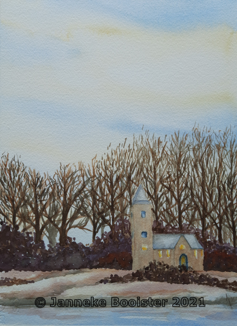
We went to the beach at the Maasvlakte, not exactly a place to go with children that want to play in the sand, but the sunset is as beautiful from that beach as it is from any other place. After parking the car we walked over the line of dunes and started walking, making pictures while we were on the way. When we reached a beautiful spot we waited for the sunset and made more pictures (no surprise here). As the tide was outgoing, there were lots of patches of water left on the shoreline, catching the sunlight and reflecting the colours of the sunset.

Today I picked one of these pictures to make a watercolour painting. As the sun was still visible in this scene I had to use masking fluid to make sure that this spot stayed as white as possible. I also masked the reflections on the water. Because of the use of the masking fluid, I could not speed up the drying process of the painting with my hairdryer so I had to wait for the colours in the sky were dry and hope they would not mix too much while the paint was still wet.

The foreground was also a bit of a challenge, with the reflected light in the water and the dark patches of sand that were left behind by the retreating water. Both water and sand were coloured by the sunset so I had to give them a light glaze without disturbing the first layers of paint too much.

After all had dried I had to remove the masking fluid and correct the white shapes so they would look like the kind of shapes that can be seen in a landscape.  

All that planning and correcting and adding and again correcting made me a bit too focused on the details so I had to walk away for a few minutes before I could see the painting I made as a whole. In fact I am really happy with the result.  Even though the reference picture has been my inspiration and guideline, the painting is not exactly how the scene looked yesterday. 

The information about the materials I have used, the size of the watercolour painting and its availability can all be found in my Tumblr blog.