This past weekend we were on a short vacation, to the German town Saarburg.
We were in a vacation home on a hill above the town, surrounded by vineyards and some cornfields that are now bare.
The weather was a bit foggy and as the temperatures were low, everything had a layer of frost. We really were in a white world, or almost white. The fact that the original colours of the trees and fields were still showing made this landscape extra beautiful.
We made lots of pictures while we were walking over the hills to the next village (Ayl) and back to our vacation home.
The afternoons were for painting, my husband Peter was enjoying the swimming pool so I could do as I pleased.
Because I never painted a landscape like this before I chose a small size paper and I decided that only a few colours would suffice to paint the atmosphere of that slightly foggy day.
Everything just seemed white, as I said before, the original colours of the fields and trees were visible. The fog made everything that was a bit further away into a gray mass. The pure white is only at the ends of the branches and the tops of the clay in the fields. This means I had to paint much more than just a few outlines. Of course i was prepared for that and I enjoyed painting this scene.
This is just the first one, I have painted more of this white world in the next days.
More information about this watercolour painting (size, materials used, availability, etc) can be found at my website www.jannekesatelier.webs.com
In previous posts I have mentioned that I was taking part in a contest, organised by the French magazine 'Plaisirs de Peindre'.
For that contest we could pick a sketch from twenty suggested ones and paint with that sketch as guideline. There were three equal rounds, each giving twenty new sketches and each ending with twenty 'finalists'.
At the end of the contest there were to be twenty winners. The number twenty that keeps coming back is of course because of the twentieth 'birthday' of the magazine.
I have entered in the first round without result and I have published my entered paintings short after I found out I did not end in the finals with them.
For the second round I have painted several paintings, published the ones I did not enter and waited for the results. I ended in the finals with this painting!
After the third round the final results and the twenty winners would be published and I waited for that to publish my painting.
I am not one of the twenty winners, but my painting was published in the magazine announcing my place as a finalist.
Of course I am very proud that I have got this far and I am ready to try again next time.
The sketch shows a house by a forest lake or pond, surrounded by trees and bushes and there is a reflection in the water.
I have made the house an abandoned building, as they are seen very often in France or further south in Europe. The forest is green, as in early summer (or late springtime) so some of the background can be suggested behind the foliage.
There is almost no wind, so the reflection is close to being a mirror image.
While I was working on it, the mystery came into my painting and I welcomed it of course.
I think the abandoned house by the lake has a nice story and I think I can best leave that to your imagination. I can paint the atmosphere, telling the story is not one of my talents.
More information about this painting (size, materials used, availability, contact information, etc) can be found at my website www.jannekesatelier.webs.com
Sometimes I make a second version of a watercolour painting in white-on-black, because I like to see the difference.
This Poinsettia is a very welcome subject for such an experiment.
I have adapted the composition to the paper size and made a slightly different background.
Because I am mixing my watercolours with white Gouache paint and have to work in many layers (the paint is absorbed by the paper and I have to 'build up' the image) there are differences in the colour values, mostly in the largest flower.
Of course I have used this to my advantage and did not have to add shadows afterwards - as is necessary in watercolour painting.
This painting is not available, my mother has it now and when she does not like it any more, my daughter is waiting in line. They both like these white-on-black paintings and drawings very much and encourage me to paint more using this technique.
More information about this painting and the watercolour I have made with the Poinsettia flowers can be found at my website www.jannekesatelier.webs.com
A few months ago I started thinking about Christmas cards.
I usually make a watercolour painting, make a good picture, add some wishes to that picture and order some printed cards.
The cards have been sent two weeks ago, I really hope the mail delivered them all.
Now it is time to post the online wishes and to add this painting to my blog.
This is the result of the work I have described above, a Christmas Card in the Dutch language of course.
My inspiration came from a book with templates to be used for drawings, embroidery or something else and I have changed the flowers a bit to get a nice composition.
I have used my Cotman set of paints - mostly because I still have them and don't want them to go to waste.
Flowers are not a subject I am very good at, but for this year I wanted to try these beautiful Christmassy ones.
More information about this watercolour painting can be found at my website www.jannekesatelier.webs.com
After having painted a lot of watercolour paintings I was looking for a change, a different technique and if possible, an experiment.
My Conté Sketching Crayons are relatively new to me (I bought them last summer and have not used them often) and I thought I could try these on my 'all black' heavy paper that I usually paint on with white gouache and some watercolour.
As the Chapel is a subject I can sketch by heart now I have done another imaginary landscape with it, now a night version.
While I was drawing I could see the composition needed the clouds and moon for balance.
These make the scene a bit more friendly - as I wanted this to be.
I have tried to place the highlights in the right places and the light in the Chapel is also where it usually can be found.
The picture was more challenging than the drawing itself. I have tried to show the right colours and contrast but I fear I haven't got everything as it looks in reality.
More information about this Conté drawing can be found at my website www.jannekesatelier.webs.com
When I was thinking of the possibilities of placing the little chapel in imaginary landscapes, this stormy weather was one of the things that came to my mind.
As I have written in a previous post some construction work was going on in my home so I have not been able to paint as often as I like, and it has taken me a few weeks to make all the paintings that appeared 'on my list' for this project. There is even more inspiration coming up now, so I am not finished yet.
The landscape resembles the 'misty' version, and this is very much like the real landscape the chapel is standing in. It is almost alone on a hilltop, visible from afar.
Maybe you have already noticed, there is always a light in my chapel, visible through the window and the open entrance.
Of course the chapel must have been consecrated, so it is home to the presence of God and there is always a light inside to symbolise that.
I have chosen to emphasise that in all the versions I have made - and will make.
More information about this watercolour painting (materials used, size, availability, etc) can be found at my website www.jannekesatelier.webs.com
Another watercolour painting with the little chapel we saw close to Reifferscheid (Germany) in an imaginary landscape.
This time a snow scene with a warm feeling to it, like one of those days with sunshine and some clouds. The winter sun is low, so its light is really almost gold in these days.
The inspiration for the colours I have chosen comes from a step-by-step demonstration in one of the magazines I subscribed to. I decided to try this combination - as far as I have the colours that are used in the demonstration in my own palette. There is a small difference, but that does not matter for the result.
I have changed the location of the chapel, now it is a bit hidden behind a line of bushes and some snow.
The winter trees are added and there is another hilltop behind the little chapel.
The shadows on the snow, indicating uneven spots hidden underneath are a bit experimental, I still have to learn how to do this. We do not often have that much snow in The Netherlands so I cannot really work from observation. Once again I have looked at some tutorials for guidelines.
More information about this watercolour painting (materials used, size, contact information, etc) can be found at my website www.jannekesatelier.webs.com
The third painting with the little chapel is a monochromatic one, I used sepia because that is a very dark colour so I can have a good range of values in my painting.
This time I added a winter tree, maybe an oak as there were lots of oak trees in the area we visited.
I have tried to paint a winter scene without any snow in it.
This is again a small size painting, mostly because my bathroom is being renewed over the past weeks and I have hidden away most of my paper to shield it from the dust that comes with these building activities.
Another reason is of course that I really am inspired to paint this little chapel in as many imaginary landscape settings as possible and it's nice to use the same paper and size for all of these watercolour paintings.
More information about this watercolour painting (materials used, size, availability, etc) and the other paintings I made with the chapel can be found at my website www.jannekesatelier.webs.com
The little chapel I have painted in an imaginary winter scene now returns in a November mood.
These days the sky is gray, the leaves have fallen and there is always a slightly foggy atmosphere. The colours of all things outside are darker than usual because of the moist air. Influenced by all that I have made a November painting.
The chapel is standing on the top of the hill and this time I have not changed that.
The fog is thick enough to let the spire fade away a little. Everything is a bit out of focus.
To achieve that I have loaded a brush with clean water and used that to make the shapes I had already painted a little blurred.
The little chapel will be starring in more of these imaginary landscapes when I will try to paint a special atmosphere. One day - later - I want to paint it as it really is and I hope that will not be too much of a disappointment.
More information about this watercolour painting (materials used, size, availability, etc) can be found at my website www.jannekesatelier.webs.com
A few weeks ago my husband Peter and me were on a short vacation in the village of Reifferscheid, Germany. We were there for the beautiful nature of the Eiffel region and we made some short walks.
During the walk we made on our last day we came across a small chapel, standing on the edge of a hill, making a nice view.
Of course we visited the chapel and made some pictures.
During the rest of the walk we had nice views of the little chapel from the other hilltops we were passing.
That little chapel inspired me, but I had to think how I wanted to paint it.
Several ideas came up and this is the first painting with the little chapel as its subject.
I have changed the scene to a forested area with snow, using the limited edition Twilight Colours for the atmosphere I wanted to paint.
There will be more paintings and I really want to paint the chapel on the edge of the hill, the way it attracted my attention.
More information about this painting (paper and colours used, size, availability, etc) can be found at my website www.jannekesatelier.webs.com
The last few days three of my watercolour paintings have been on display at the annual Amateur Art Exposition of the Amateur Art Association called 'Goed Gezien - Goed Bekeken'. This association is active in the region called Molenwaard, The Netherlands.
I am happy to live in that region and to be a member of that association.
This last day of the exposition I was able to visit and help with supervising the exposition.
My watercolour paintings were together and my husband Peter made this picture of me and my art a few minutes before closing time.
More information about my paintings and the exhibitions I participate in can be found at my website www.jannekesatelier.webs.com
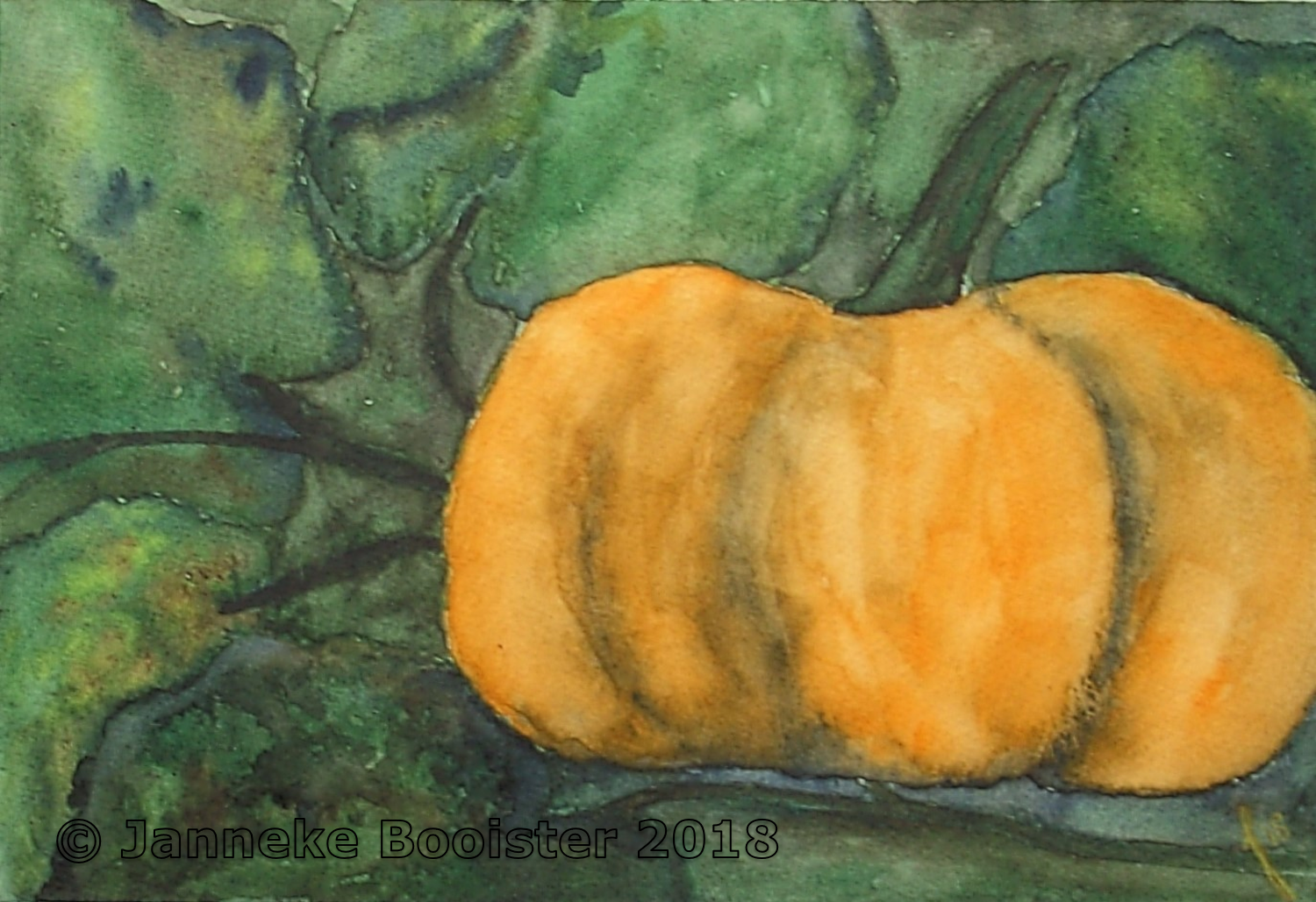
The month of October has a lot of autumnal themes in it and many of these are used for online challenges. To paint the theme in the challenge and publish the painting is a nice way to go out of your comfort zone and I have been doing that several times lately.
This time the pumpkin was twice in a challenge and I like the subject, so I gave it a try.
As pumpkins are not a familiar sight in my country I had to imagine a scene using some reference pictures for the leaves of the pumpkin plant and my memory of some pumpkins that are for sale in vegetable stores in this time of the year.
I made up a scene with a pumpkin, some leaves and stems and as I was painting, more leaves were added.
While painting I decided to make a dark background in shades of green so the orange of the pumpkin would stand out.
This painting was evolving while it was being painted, that happened because I did not have much of a plan when I started painting. The result is maybe even better than I hoped for when I started drawing my pumpkin and some leaves.
More information about this still life (materials used, size,contact information, etc) can be found at my website www.jannekesatelier.webs.com
As I wrote in my previous post, we made some signposted walks during our short vacation in Reifferscheid (Eiffel, Germany). Only the second (and last) walk was signposted not so very well.
We were happy that my husband made a picture of the information board that had all the signposted walks drawn on the map so we could find our route with the help of that picture and a navigation app.
We came upon this signpost, showing lots of destinations, but our route was not indicated.
Despite that little fault, the signpost itself was a perfectly placed element in the landscape, the white of the indicating signs contrasting with the dark bush behind it.
I made some reference pictures and painted this scene in the afternoon when we were back in our vacation home.
I do not use rough paper very often, grain fin (or cold pressed) is my usual choice.
For this small scene I decided to try something different and I had a bit of a struggle of course, but the result is nice.
There are some unexpected qualities to the structure of this paper and I will have to explore that a bit further - and I guess I will enjoy doing so.
More information about this watercolour painting (materials used, size, availability, etc) can be found at my website www.jannekesatelier.webs.com
We did stay in Reifferscheid long enough to make some signposted walks. We chose some short walks of five to seven kilometers and after those walks we would take time to rest and relax in our vacation home. That was also the time for me to paint, making the most of the daylight. The evenings were for reading.
The walks started on the parking place where our car was, not far from the vacation home. We just had to pack a lunch, close the door and start walking.
The first walk we chose went downhill from the hilltop and followed a little valley towards a neighbouring village and then back again through a small forest area and the village of Reifferscheid, which is more than just the hilltop with the remains of the old castle (where our vacation home was located).
There were lots of great views and my husband made the reference picture for this watercolour painting.
The 'horizon' is high in the painting, a change compared to my usual compositional choices.
I made the ruins with the white tower my point of interest and chose to add some drama to the bushes in front of the hill that has the ruins on top.
The path uphill and the sloping fields are suggested, not detailed.
Nowadays a lot of cityscapes are painted in a composition like this and I tried to adapt that style so I could use it 'my way' for this scene. Of course I had to think a little more while painting this one, but I am pleased with the result of my efforts.
More information about this watercolour painting (materials used, size, availability, etc) can be found at my website www.jannekesatelier.webs.com
Last week we had our autumnal short vacation and this time we went to a small vacation home in Reifferscheid (Eiffel, Germany) that is part of the old castle complex.
The vacation home was as modern as we wanted it to be but the setting is great.
In a few minutes we could walk up to the ruins of the old castle and the views there were great! The first day we walked there at the time of sunset and the fading light gave the views something special. We made a lot of pictures there.
This painting is made using two reference pictures I have taken of the view to the east, the setting sun in my back.
The hills in the distance cannot be seen very well in the fading light and the evening mist and the ruins of the old castle are also looking like one big mass of stones in which the different structures are not told apart easily.
The watercolour painting was made in our vacation home and I usually do not take all my art materials with me, only those that can be packed and moved in one or two bags.
That is why I have painted on cellulose paper, not my first choice, but I am learning to use it my way. This painting had some 'this will never work' moments but in the end I am happy with the result.
I have tried to paint the atmosphere of an evening in autumn in the fading light after sunset and I think I got what I wanted.
More information about this painting (materials used, size, availability, contact information, etc) can be found at my website www.jannekesatelier.webs.com
Of course I have to paint autumn leaves because I like their colours. I have not gathered any fallen leaves for a nice reference, so I made this scene from my imagination.
I started with dropping three colours on wet paper and waiting for that to dry (with a little help of my hair dryer)
Then I took a watercolour pencil and started drawing a composition. I looked at my 'leaves and apples' painting for some help with the shapes and then I added fallen leaves.
After this all was painted, I added some more branches and leaves in places where they seemed to be right.
I wanted to do it this way because at first I could not predict the results after all paint had dried. Adding some branches and leaves is better than being sorry to have painted them and the composition does not work.
For this painting I have used some of my study - quality paints, because I still have some of these and letting them sit on a shelf is not the way to use your paints.
This was fun. I have been playing with paint and water and then for the composition of the branches and leaves I have tried to react to the results of this background painting.
More information about this watercolour painting (materials used, size, contact information, etc) can be found at my website www.jannekesatelier.webs.com
In this autumnal scene I have combined two prompts for this month again, trees and clouds. Landscape painters do lots of clouds and lots of trees, so I had to think of something I had not done before. That is not an easy task.
For this painting I have used a reference picture I have made last spring, so I had to change the colours. In a magazine I found an example of a landscape in autumn colours that inspired me to follow its colour scheme and translate that to watercolours. I changed the fields into a pond and now I only had to paint it.
As I have done before this watercolour painting is built up by mixing the colours wet-in-wet, placing shadows and highlights where I want them to be and adjusting it all because of the unpredictability of watercolour.
The atmosphere could have been much darker, but I wanted the trees to be golden and red, so there had to be some light.
This is what I hoped it would be and I have enjoyed painting this one.
More information about this painting (paper and colours used, size, contact information, etc) can be found at my website www.jannekesatelier.webs.com
For this still life I have combined two of the prompts given by Doodlewash; cookies and hot drinks. After much thinking I have used the handmade cup that stands in my studio holding my sketching pencils and imagine some hot chocolate in it.
I have placed the cup next to my watercolour paper and made my drawing.
The cookies are from my memory. Placing fresh cookies in my studio would not be a good idea as they would not last long enough to be painted.
The right colours for the hot chocolate and the cookies were hard to find.
I have no problem getting my cookies in the right colour when I am baking them, painting them in the right colour was quite a challenge. I am not completely happy with the results but for a first attempt it is not so very bad.
For this painting I have also used Chinese White for the cookies and Iridescent Medium for the cup and I have suggested some vapour coming from the hot chocolate with the Iridescent Medium.
Autumn is not only about falling leaves, chestnuts, mushrooms and great colours but also about comfort food and this painting is all about that part of the season.
More information about this watercolour painting can be found at my website www.jannekesatelier.webs.com
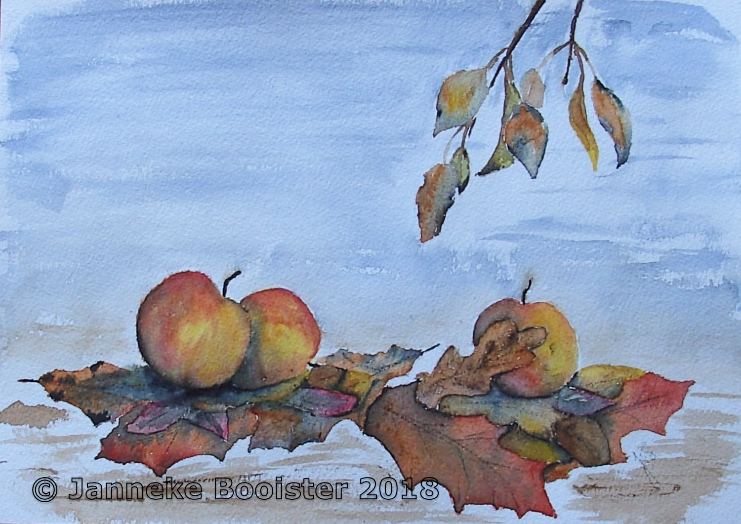
Autumn is here now, outside in nature and mostly in the shops with great food ideas, warming spices and lots of apples and pears.
Doodlewash is in autumnal moods also this month and I have combined two prompts into one still life painting.
I have made my composition directly on the watercolour paper and started painting wet-on-dry. Of course after that first layer of paint the next were done wet-on-wet and the colours of the apples and leaves were mixing as I had hoped they would. Well, most of the time they were doing as I hoped, I had to work a bit harder on some areas.
The paintings and drawings I make inspired by the prompts on the Doodlewash site are always 'something different' compared to my usual work. Here I have used some colours I don't often use and drawing a composition directly on my watercolour paper is also a bit of an experiment. There was no example and I made it up while drawing, adding leaves, apples and in the end the little branches from above while I was listening to my intuition.
The result of all those experiments is what I hoped it would be.
This painting was made for practise and improving my skills and I am always happy when a work like this turns out nice.
More information about this painting (materials used, availability, size, etc) can be found at my website www.jannekesatelier.webs.com
The leaves of our chestnut tree are changing to their autumn colours now.
During the long hot and dry summer there were already some leaves with brown spots, but now they are changing fast. Soon they will be completely brown and fall off.
I made a reference picture on a calm day, not so much wind that the branches and leaves were moving too much for a good picture.
The leaves with all the autumn colours were what I wanted to draw and here is the result.
There is still some green left, yellow, brown and dark brown are also in the same leaves.
I enjoyed drawing this scene, layering and mixing the colours of my pencils until I had the results I wanted.
More information about this drawing (materials and colours used, size, contact information, etc) can be found at my website www.jannekesatelier.webs.com
The nature in our country is beautiful, but sometimes very wet. To be able to walk in these areas plank paths are constructed and maintained as part of the signposted walks.
Our last walk in 'Landgoed Visdonk' passed by one of those paths. The forest pond it crosses is a large one and the views are beautiful once on the path. This pond is an open area between two parts of the forest.
The plank path is very close to the surface and constructed in a slightly curvy way.
I have made some reference pictures at the beginning of the path for later use.
It took some time before I knew what I wanted to paint, the day was bright and sunny and the pictures I made are very detailed. Because detailed painting is not the style I like the most I had to think of something else.
For this watercolour painting I have changed the atmosphere of the scene from a bright sunny day into something more moody.
The foggy atmosphere is not so very strange in such a place, these forest ponds are well known for their morning fog after cold nights.
After all this thinking I sketched the path and the lines of the forest in the background and started painting. I have used a limited palette of only four colours and only the beginning of the path has the suggestion of details.
More information about this watercolour painting (paper and colour used, size, availability, contact information) can be found at my website www.jannekesatelier.webs.com
Twelve years ago, on a short summer vacation in Scotland we visited a lot of beautiful scenery, great views and some tourist attractions.
Driving the Trossachs Trail we stopped at The Duke's Pass to see the views - and to make photographs of course. The whole family was there, each with a camera so there were lots of photographs for the album I usually make after such vacations.
From that album I selected a few photographs of the same mountains and valleys - each a bit different from the other.
The dark clouds above the mountains were great for a painting so I have tried to make them as moody as possible.
The mountains in the Scottish Highlands are not completely covered with forest and woodland, as are the high hills of The Ardennes or the mountains of the Sauerland, which are situated more southern than Scotland. In the Trossachs the mountains are not completely bare, there are grasslands and fields with mosses that give the area a nice green appearance in summer. Unfortunately I do not know anything about the other seasons.
For all that green I have mixed, layered, placed shadows until I was convinced I had achieved the same moody atmosphere as I had given to the clouds.
More information about this watercolour painting (colours and paper used, size, contact information, etc) can be found at my website www.jannekesatelier.webs.com
Twelve years ago we were in Scotland for a week of vacation. At that time 'we' meant my husband, son, daughter and me and we all had a camera, so that vacation was well documented with photographs. Two of the cameras were still analog, using films.
We did not go far into the Highlands, but we did see a lot of the area called The Trossachs, as we went for rides and signposted walks not far from our vacation home.
One day I was going through the album of that summer vacation and I was inspired by the pictures of the mountains and clouds we took that week.
There are lots of mountains in The Trossachs and at one view point we could make pictures all around us, so I just had to pick the most inspiring point of view.
Working with an album full of photographs that cannot be replaced beside me is not very relaxing, so I decided to do a charcoal drawing. Charcoal is a dry material and it can be brushed off when an 'accident' should happen.
With those precautions taken, nothing happened of course.
Looking at several pictures I came to this composition. One of the pictures showed more details of the mountains, another picture showed the clouds, a third picture showed the scene from another angle and more.
What attracted me here was the dark sky full of clouds and wide view of the mountains and the valleys between them.
More information about this charcoal drawing can be found at my website www.jannekesatelier.webs.com
Almost two years ago my husband and me had a short vacation in The Black Forest in Germany and we visited the ruins of Allerheiligen. We made some pictures and I made watercolour paintings. The first watercolour I made had the colours as they were, and the yellow tree did look great in reality, in the reference picture and not so great in the watercolour painting. The painting was laid aside and I tried again with another palette. That second painting pleased me more.
Last summer, during my painting vacation I was introduced to 'painting over' and made some nice personal versions of pages from an atlas.
We also did 'metamorphosis' paintings, with a simple painting to start from and adding new elements each next version.
For this painting I have combined these two ideas. I took the watercolour painting and started drawing using my Conté Sketching Crayons, adding some dark areas to the ruins and changing the shape and quantity of the surrounding bushes and trees.
In this way I have made the yellow tree a part of the background instead of something that did not belong in that place.
The added plants and bushes make this place look more abandoned.
This version pleases me much more than the original painting (which does not exist any more) and now I have come closer to the atmosphere I wanted for this scene.
More information about this painting can be found at my website www.jannekesatelier.webs.com
It's about time for an update on the chestnut tree in my front garden.
The chestnuts are falling off early this year, probably due to the hot and dry summer we had here. They fall inside their shells this time, sometimes in small groups with a part of the branch they were growing on.
Most of these will end in school, as my husband is a (primary) school teacher.
I have 'saved' some of them and used a chestnut in its shell and a bit of a branch for a drawing.
For this drawing I have not made a sketch, the model was on my drawing table and I have used it directly.
I have chosen some colours from my Graphitint Pencils and my Watercolour Pencils and combined them, mixing colours like I do when I am painting, until I had the results I was looking for.
More information about this drawing (size, paper and colours used, contact information, etc) can be found at my website www.jannekesatelier.webs.com
Sometimes I use a sketch more than once. This poplar tree has already been the subject of a charcoal drawing, but at that time I did show much more details of the background and the surrounding landscape.
During my painting vacation our teacher also talked about our previous works and gave some tips we could follow to improve our future works.
So I made a watercolour painting using the sketch of this tree and followed some of the advice I was given.
The background is not detailed, only suggested by wet-in-wet painting. This technique also gives more muted colours, especially when the greens and browns are mixtures of more than one colour of paint. The dried paint gives an illusion of a foggy day.
The foreground is now only a suggestion of grasses and herbs.
The surrounding landscape is still here, but does not distract the viewer's attention from the subject of the painting.
Once again I concentrated on the atmosphere of the painting.
This was to be a 'portrait' of the poplar tree, so this tree is a presence in the painting.
More information about this watercolour painting (materials used, size, availability, etc) can be found at my website www.jannekesatelier.webs.com
A few weeks ago I was contacted by a nice lady who was interested to buy one of my watercolours made after I visited Kinderdijk (Netherlands).
This was an end of winter scene.
The lady wanted to frame the painting according to the interior of her home, so I delivered only the painting. On other occasions I delivered a framed painting.
After the framing was done I was invited to come and see how my watercolour painting was doing in its new home.
I was allowed to make some pictures and this is the best of those.
More information about the other Kinderdijk watercolour (and the other paintings) I made can be found at my website www.jannekesatelier.webs.com
The end of the long, hot summer is here and most of the days the weather is inviting for a walk. Very close to my home is the 'Alblasserbos' so we don't have to take the car to get to the beginning of our walk. The forest area itself has lots of oak trees, willows, beech trees and poplars, but the outer edges have bushes of all sorts.
Amongst these bushes are some Viburnums and they are showing their berries now. The leaves are changing colour and are full of small holes, that may be due to the extremely dry summer we had this year.
I made some reference pictures with the idea to paint the berries and some of the leaves.
Of course I could have used a white background, but that was not what I wanted. The rest of the bush - and the other bushes standing next to this one - are suggested by the variety in green colours and some lines that suggest more leaves.
The background is done wet - in - wet and the suggested leaves are placed on a dry surface and faded with a little water.
I had applied masking fluid for the branches and it was not easy to fade the hard edges after removing the masking fluid. Maybe next time I will try to shape the branches by taking out the paint with a moist brush, so I can compare the results of both techniques.
The leaves and berries were left white and filled in later. Finding the right shade of green was the next 'problem' and I have added a bit more yellow and a brown to suggest the autumn colours that were visible in most parts of the bush.
The berries had different colours, some very red, some a bit more orange. Finding the right colour mixes was not difficult. I added some suggestions of berries to the background.
The leaves were still not what I wanted, so I took one of my Line Markers and drew the leaf veins with it. The result was what I had hoped for and I decided to stop at this point.
The picture may not show the painting as it is, please tilt the screen a bit to see all the shades of green I have painted.
More information about this painting (materials used, size, availability, etc) can be found at my website www.jannekesatelier.webs.com
Most of the zoological gardens in The Netherlands are very nice places, not only because of the animals but also because of the park area. The 'Dierenpark Amersfoort' is one of those zoos with nice large trees, a lot of plants and a great scenery.
This Zoo has a small Japanese Garden, with some rocks, places for meditation and a pond with Koi carp and a waterfall.
The day we visited 'Dierenpark Amersfoort' was a very hot, sunny day so I found myself a spot in the shadows and sketched the waterfall while the others were exploring other parts of the Zoo. After I had finished my sketch I also made a reference picture to remember the colours.
This watercolour painting is based on the sketch, with a very little bit of help from the picture.
The paper I have used here is new for me, this is a quarter of a sheet Arches grain fin. I have soaked and stretched it and started drawing the most important lines as soon as the paper was dry. After that.... painting!
Rocks like these are something I do not often see in our landscape so they still are a challenge for me. The trees behind the rocks and the water of the pond were easier.
This place, hidden in the small Japanese Garden was filled with shadows from the trees behind and above the rocks and the rocks themselves that blocked most of the light.
So the white, falling water and the green plants that grow between the rocks do stand out against the dark, wet rocks.
The water of the pond looked dark because of the shadows of the rocks.
There were lots of other visitors and the little bamboo fence I had chosen to sit on was not very comfortable so after I had finished my sketch I joined the others for our lunch.
If I had been alone in that place it would have been very relaxing and I have tried to show that quality in my painting.
More information about this watercolour painting (size, materials used, availability, contact information, etc) can be found at my website www.jannekesatelier.webs.com
This time I have a blog post about something new (for me); greeting cards!
In the past I have been ordering very limited amounts of greeting cards for personal use, but suddenly inspiration came: I will sell them!
I have used some of my recent watercolours for these greeting cards.
They are double cards with a blank inside so they can be used for almost all purposes.
Just write your message 'Happy Birthday' or 'Get well soon' or 'Congratulations with your anniversary' or what might be the occasion.
The greeting card come with a white envelope.
The price is very friendly; € 2.00 for one card and € 17.50 for a packet of ten cards.
I will have to ask a contribution in the shipping costs as these prices are really low.
These prices are valid in 2018, they may change in the future.
You can indicate that you are interested by using the contact form of my website www.jannekesatelier.webs.com or the contact form of this blog.
Bij wijze van uitzondering schrijf ik ook een stukje Nederlands in deze blog post.
Ik heb namelijk iets nieuws (voor mij); wenskaarten!
In het verleden heb ik wel wenskaarten besteld in kleine oplagen en voor eigen gebruik, maar ineens kwam de inspiratie om ze te gaan verkopen!
Ik heb een aantal van mijn recente aquarellen gebruikt voor deze wenskaarten.
Het zijn dubbele kaarten met een blanco binnenkant, dus ze kunnen voor bijna elk doel gebruikt worden. Schrijf er zelf de wens 'Hartelijk Gefeliciteerd' of 'Beterschap' of 'Gefeliciteerd met jullie ... jarig Huwelijk' of wat er maar van toepassing is.
Er zit een witte enveloppe bij de kaart.
De prijs is erg vriendelijk; € 2.00 per kaart en € 17.50 voor een set van tien kaarten.
Ik moet dan wel een bijdrage vragen in de verzendkosten, deze prijzen zijn erg laag.
Deze prijzen gelden voor 2018 en kunnen in de toekomst veranderen.
Iedereen kan zijn interesse voor deze kaarten laten weten via het contactformulier van mijn website www.jannekesatelier.webs.com of via het contactformulier van deze blog.
The list of suggestions for September 2018 gives 'Read a Book Day' for this day. As you no doubt have already noticed, I do not paint or sketch using every prompt in the list supplied by Doodlewash. I need to be inspired to paint (or draw) before I even start thinking about what I will make for the occasion.
Reading books is one of my passions (besides watercolour painting and cooking) so I wanted to do something with this day.
Open books with things (gentle or not) coming out of them are a very common theme so I had to do something else. When reading a book I sometimes 'disappear' in the story I am reading so that was to be the theme. And now something that fits my skills....
The idea of diving came up, the diving that is done in a swimming pool and there is no water splashing in all directions but words, or fragments of words.
As I have not been in public swimming pools for years, I had to imagine a structure for the tower that holds the diving board. Photo references on the Internet show many possibilities, so I invented my own. This one is for diving into a good book so there should be no limits.
This time I have used my Watercolour Markers - and a brush with some water - for most of the image and I have added Line markers where I thought they would be needed.
I am still exploring the possibilities and limitations of these markers and I am not disappointed with the result of this experiment.
The letters are parts of the words 'read a book' in English, Dutch and French.
More information about this line and wash drawing can be found at my website www.jannekesatelier.webs.com
According to the list of subjects suggested for this month (September 2018) by Doodlewash today is Skyscraper Day.
In The Netherlands we do not have real skyscrapers, due to the condition of our soil. For inspiration I had to go to the Internet, to find me some reference pictures of skyscrapers. Of course I have used a vanishing point and a lot of lines (and my eraser), for the perspective has to be right in a composition like this.
I had already decided that I would make a painting 'looking up'. The reason for this choice lies in the Dutch name for these buildings; 'wolkenkrabbers' which translates to 'cloud scrapers'. I wanted the buildings to disappear in the clouds and a 'looking up' view would make painting that just a bit more challenging.
As it all had to be imaginary I have not copied the glass buildings that can be found on the Internet, but decided to use the colours of bricks for my buildings. This way they look more like the buildings that can be found in The Netherlands.
For this painting I have used the cellulose paper I had bought recently and this time the 'fight' was just a little bit harder. This could be caused by the fact I had to do buildings with straight lines this time, combined with the vague shapes in the clouds.
My hairdryer has done a good job here, more than once.
Once again I have used the suggestion by Doodlewash to try something I do not usually do. This time I have painted imaginary buildings in an unusual perspective.
More information about this watercolour painting (size, materials used, availability, etc.) can be found at my website www.jannekesatelier.webs.com
In some of my earlier blog posts I may have mentioned that I am member of Doodlewash.com, and that sometimes I use the prompts they supply to get inspiration for a painting.
For the month of September (2018) the prompts are based on really existing remembrance or appreciation days. Today it is Ginger Cat appreciation Day so I just had to try to paint one or more Ginger cats!
I used the references from 'Plaisirs de Peindre' Magazine that I have used before to make drawings. The drawings were not so hard to do, watercolour is quite a challenge when it is about the cats. The tree trunk they are climbing on was easy.
I have tried to use different colour mixtures, based on Burnt Sienna to make two different cats. Ginger cats come in all sorts of colour mixtures, some of them have a lot of white in their fur, others are in shades of an orange-brown with more or less stripes.
The cat on the left only got some sense of roundness after I had used pencils, as all the paint I applied continued to flow out to become a very flat looking surface.
I do not know what caused that problem, maybe the colours I used to mix the shades of 'Ginger' for the fur.
With this painting I have tried to paint animals - a subject I usually avoid. That said, the results are not very bad and I might want to do this more often to become more experienced and (I hope) better.
This painting was done mostly for the fun of planning and painting a watercolour of two Ginger Cats.
There are more remembrance days in Doodlewash's list for this month so there will be some more paintings that I would not usually do.
And the title of the painting? That comes from the Dr.Who fans.
Last spring my husband and me made some signposted walks in Natural Reserves in The Netherlands. We made lots of pictures and I have painted from those references since then.
These delicate new leaves were showing themselves during our walk at the 'Oude Buisse Heide' and I could not resist taking a picture. The tree is a Copper Beech (Fagus sylvatica 'Atropunicea) and that is one of my favourites because of its beautiful colours and majestic shape.
I had to 'gather courage' before I started to paint them, but now I have made the watercolour painting I am really happy with it.
To create the depth in this scene I have used a trick from photography. The branch with the fresh leaves (my subject) is well defined, all other branches, leaves, trees, bushes etc are painted as vague shapes. The result looks a bit foggy and I like that atmosphere for this painting.
For the highlights on the branch and in the leaves I have used a Watercolour Stick on the dry painting. The structure of the paper helps me get that broken line.
More information about this watercolour painting (size, colours used, availability, etc) can be found at my website www.jannekesatelier.webs.com
The reference picture for this painting was made by my husband Peter during a walk in the dunes with colleagues - so I was not there and only saw the pictures afterwards.
The pictures stayed 'in stock' until inspiration would hit me.
I am still trying to paint according to the advise I was given during my painting vacation - atmosphere first, details only when needed - and this scene is perfect for such a painting style.
A few days ago I have made a visit to my art supply store and I bought some Winsor&Newton Watercolour paper and of course I had to try that. Only after I had opened the plastic protecting the block I found out that this is a cellulose paper so I had to adapt a bit, as I usually paint on cotton paper. (W&N also has cotton paper)
This paper is different than my usual quality but I like the differences and they are not hard to deal with.
These Dunes at the end of winter are showing only the dark branches of the bushes (that will be green in summer) and the sand in between. While working I changed the scene a bit to get a better painting and I am really happy with the result.
More information (size, materials used, availability, contact information, etc) can be found at my website www.jannekesatelier.webs.com
This year we have a very dry, very hot summer and now (halfway August) lots of trees and bushes have begun to change to their autumn colours. The colour change varies from subtle to very visible and even loss of foliage and an early shedding of fruits (acorns, chestnuts, etc.) is happening now.
Our walks in parks or nature reserves are colourful and inspiring me to make reference pictures so I can paint later.
We made a short walk in the area of the 'Broekpolder' near Vlaardingen (Netherlands) and a large part of that area is being grazed by Highland Cattle. They can be seen almost everywhere and they are not shy at all. This mother and child were in one of the lower fields, following the path that was made by some other members of the herd towards the water.
They are partly hidden by the high grasses and make a nice point of interest.
Sketching them on smooth paper is easy, I had to do that to explore the forms of the cattle as I do not often draw or paint cattle. To copy that initial sketch to my watercolour paper is a bit of a challenge as the surface of my watercolour paper is textured. In fact this took me more time and use of the eraser than the initial drawing in my sketchbook.
Once again I have tried to focus on atmosphere in my painting, so the Highland Cattle had to be recognisable but not very detailed. The field has many grasses and herbs and that gives a very colourful view. The bushes are very close to the water and have not started to change colour but the trees are further off and already changing to their autumn colours.
I am still exploring this 'new path' I have chosen for my paintings and I am looking for variation in my choice of subjects in order to find out what suits me best.
So my travelling along this 'new path' will be continued, but I do not really know where it will lead me.
More information about this watercolour painting (size, materials used, availability, etc) can be found at my website www.jannekesatelier.webs.com